Audra Security
Firewall App
I led this project as a UI/UX Designer at Dotlines UK. Certain details are kept confidential, but the core UX logic and improvements remain the focus.
Background
Audra is a 2-in-1 router and firewall solution built for the modern digital age. From family homes to growing businesses, Audra’s AI-powered system protects networks from online threats, guards personal data, and provides privacy through an intuitive interface.
My Responsibilities
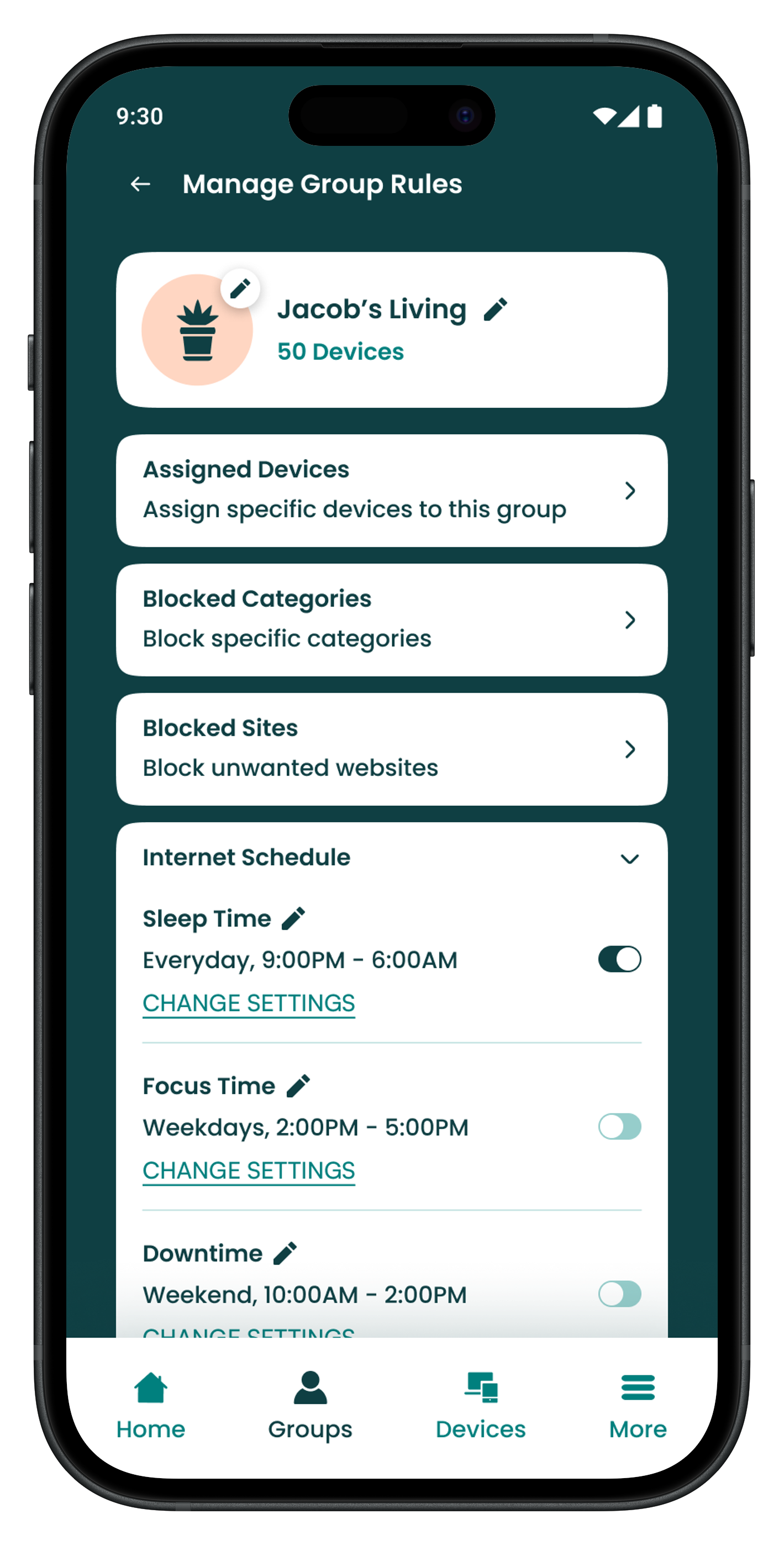
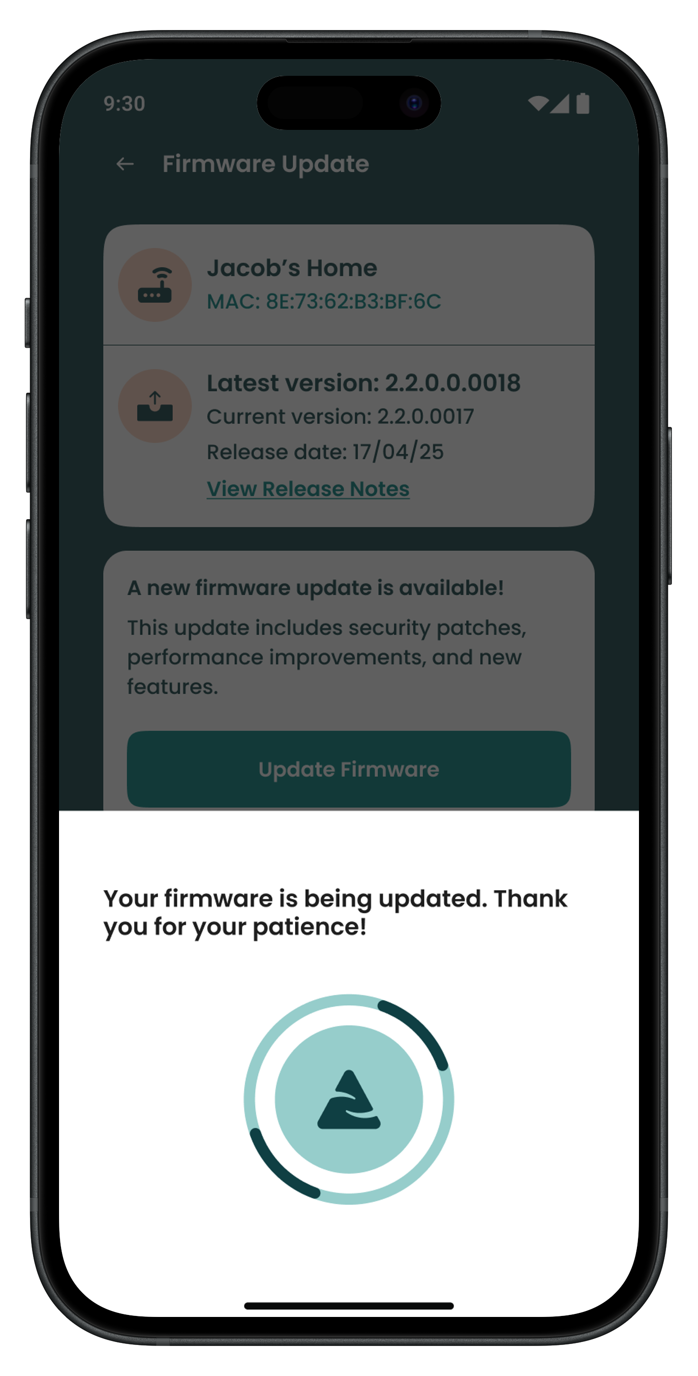
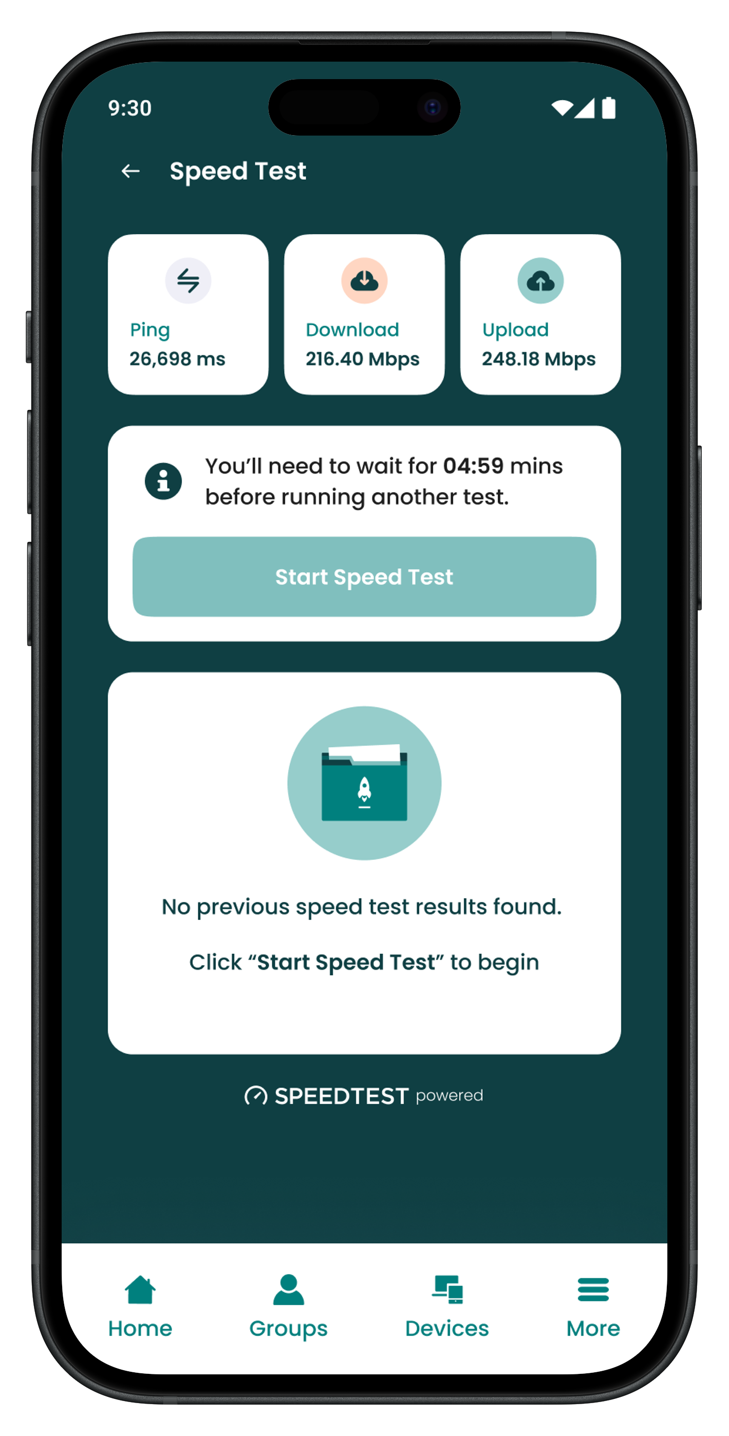
I worked on the redesign of the consumer app, focusing on simplifying the core user journey. My role involved cleaning up the general flow, adding new features like speed testing and firmware updates, and bringing everything together with a brand refresh.
Design Review
I began the project with a discovery phase alongside the Product Manager, identifying key areas for improvement and defining a suite of new features. My focus was on identifying core user pain points and auditing existing workflows to determine which features needed improvement to meet current industry standards.
🛠️ Key areas to improve
User friction: User journeys required multiple steps and high click-counts to complete core tasks.
Accessibility gaps: The existing visual language failed to meet WCAG standards, with low colour contrast ratios and typography that compromised overall readability.
Outdated visual identity: The original UI felt visually dated and lacked the modern polish required to compete in today’s market.
⭐ New features to introduce
Speed testing: Build in a simple speed test feature, letting users check their connection performance right from the dashboard.
Firmware updates: Design a straightforward way to handle firmware updates, making it easy for users to keep their hardware secure and running the latest software.Introducing reboot functionality.
Device reboot: Add a one-click reboot feature so users can quickly troubleshoot and restart devices when things aren't working right.
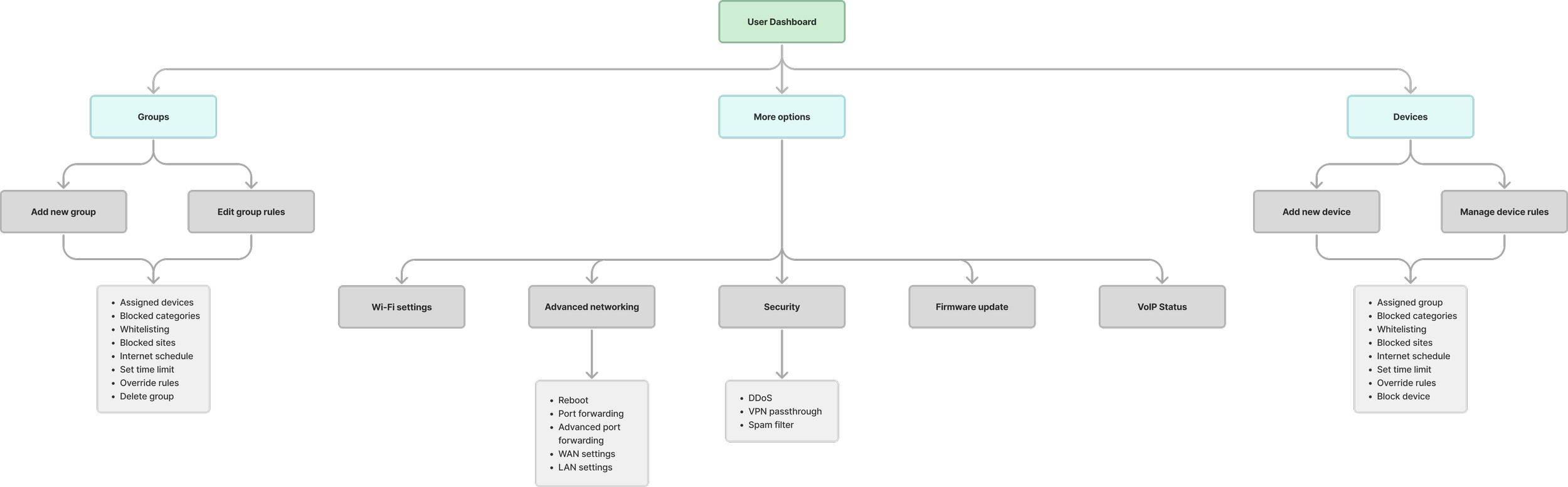
Restructuring the app flow
With the goals and new features clearly defined, I set out to make the app feel more intuitive. My focus for this phase was to cut down on unnecessary clicks and simplify the experience through two main objectives:
1. Minimising friction
I audited the existing pathways to identify where users were getting stuck in click loops. By flattening the architecture, I reduced the number of steps required for core tasks, turning complex processes into a more intuitive experience.
2. Strategic feature placement
Rather than just adding the new speed test, firmware, and reboot features, I mapped out exactly where they would provide the most value within the user’s journey, ensuring they were accessible exactly when a user would need them most.
UX validation & feature integration
To validate the new architecture, I conducted internal usability testing with low-fidelity prototypes. I redefined the dashboard as an active command hub by prioritising the strategic placement of high-utility features. This shift moved the dashboard from a passive status display to an actionable tool, significantly reducing the time to complete tasks for core user needs. This ensured the structural logic was sound before we applied the final branding refresh.
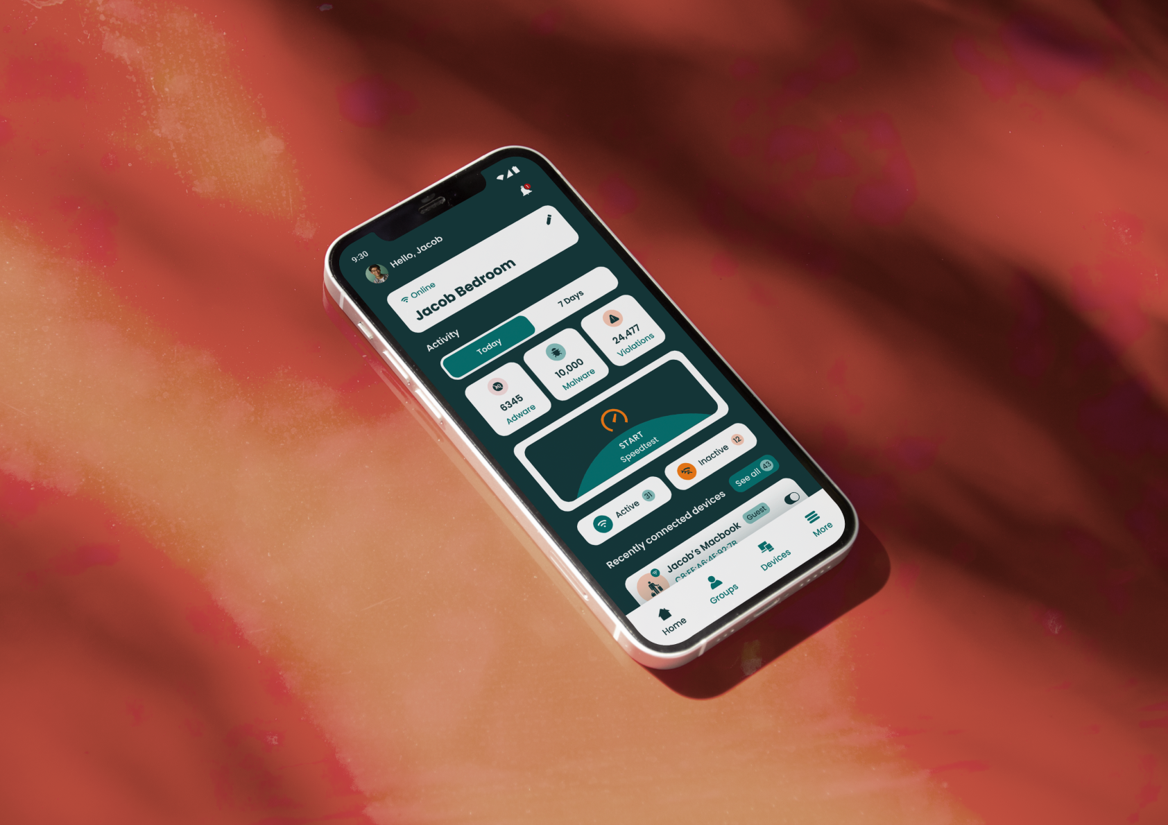
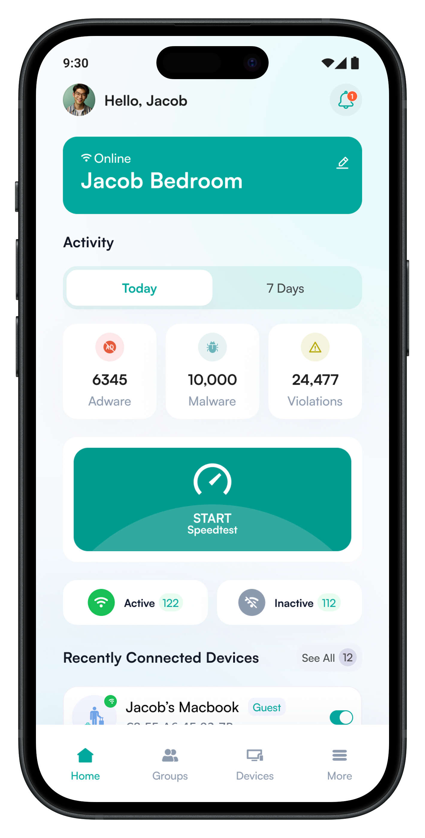
Original dashboard
core tools buried
cluttered hierarchy
multiple clicks to complete a simple action
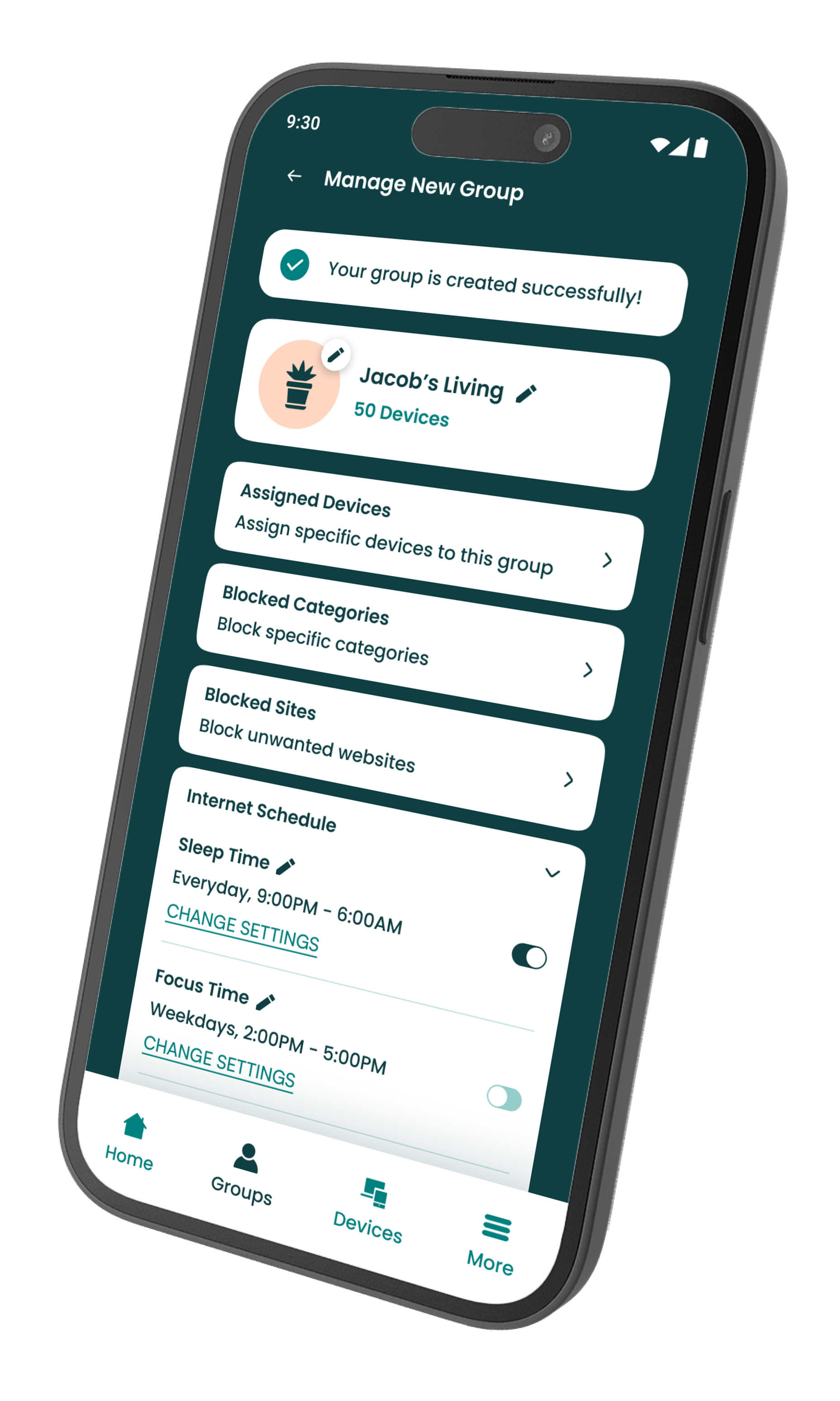
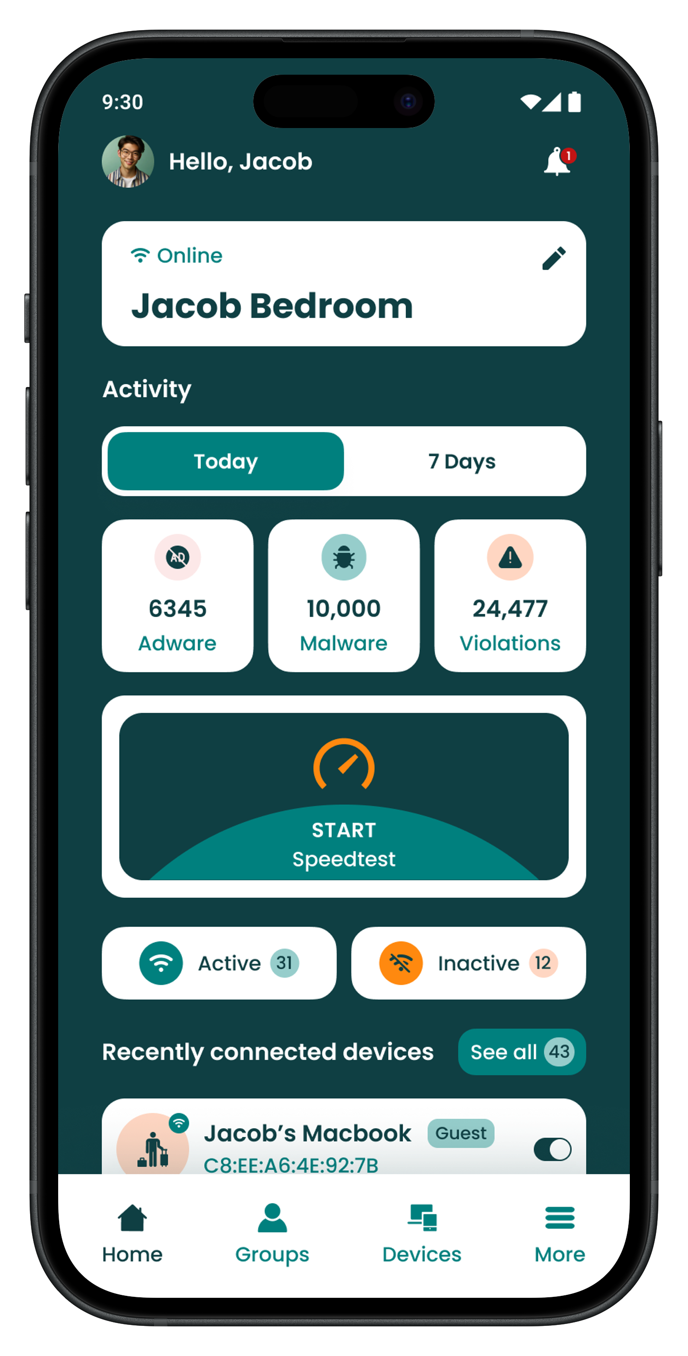
Updated dashboard
simplified structure
surfaced core user tools
validated the information architecture
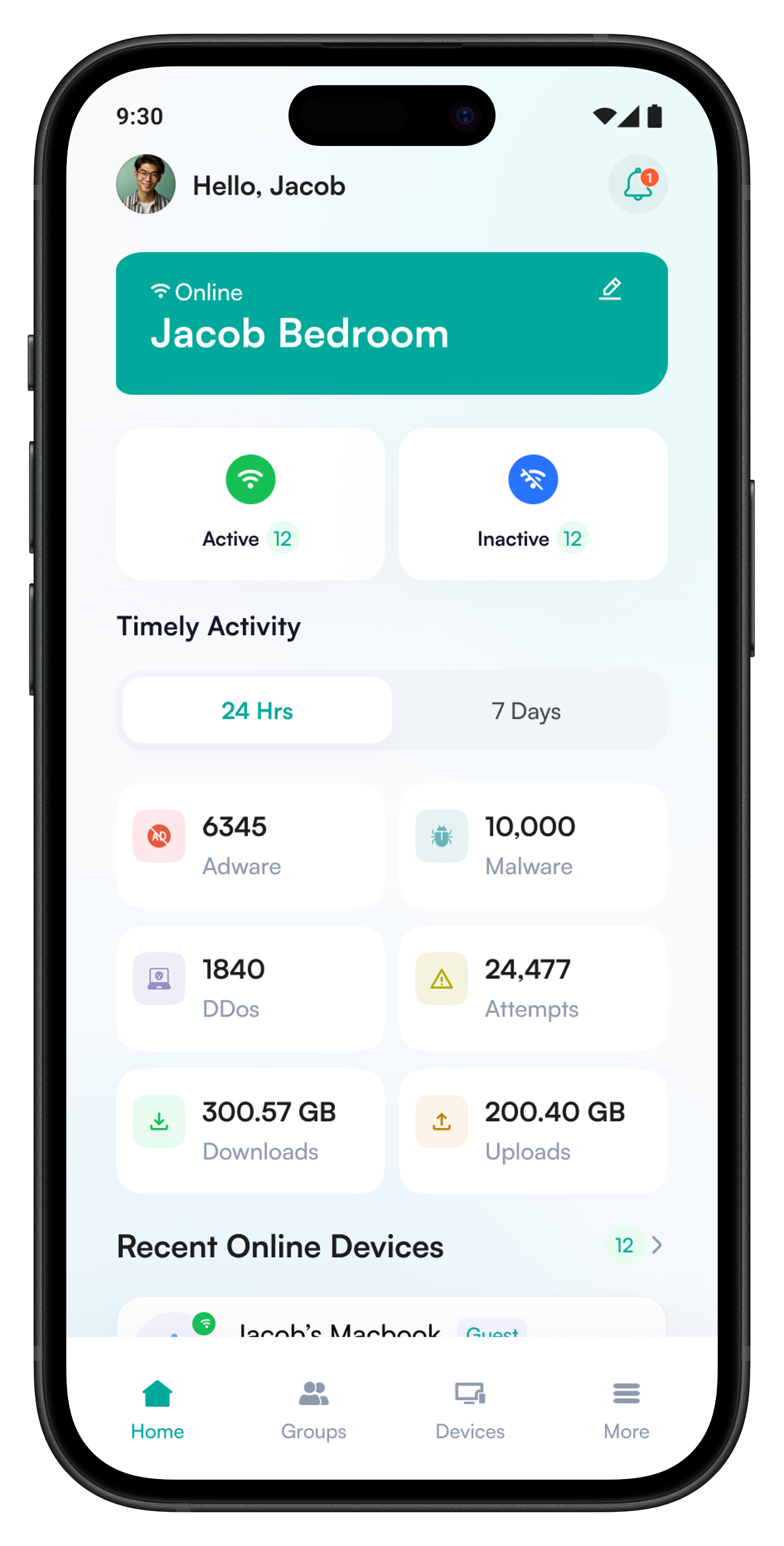
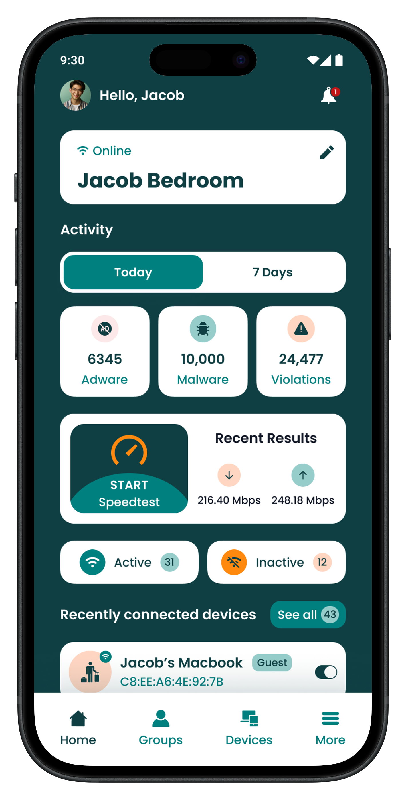
Final dashboard
modernised brand refresh
WCAG 2.2 compliant
streamlined structure
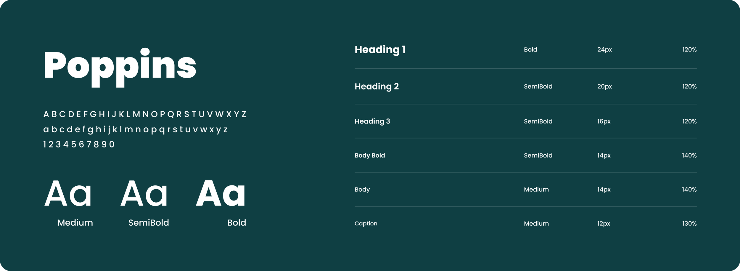
Style Guide
With the core logic validated through internal testing, I transitioned into the high-fidelity phase. I translated the Creative Lead’s refreshed branding into a WCAG compliant mobile design system to ensure every component met strict accessibility standards.
Colours
#FF890F
#FFD6C2
#96CDCB
#0F3F43
#00807E
Typography
Prototypes
I rebuilt the interface, merging the brand's renewed visual identity with streamlined user journeys and a robust feature suite. While the full project spans nearly 150 screens, covering everything from happy paths to failure scenarios, I’ve highlighted a few key moments below that best represent the core experience.
Project Insights
I was able to turn user insights into action by stripping away friction from the user journey. I introduced one-tap features like integrated speed testing and removed the headache of firmware updates. To bring everything together, I applied a complete UI transformation to consumer app, bringing the entire experience under a sharp and modernised brand identity.
Next Steps
With the consumer app’s core features and visuals complete, my next step is to bring that same modern, accessible standard to the business-facing portal. I’ll be using the new design system to ensure the business portal feels just as intuitive and cohesive as the consumer experience