Catena
Dashboard Design
I completed this project in the role of a UI/UX designer at Dotlines UK.
Background
Catena is an all-in-one, cloud-based platform specifically designed for telecoms operators. It serves as a unified environment to handle the entire lifecycle of service provision, replacing fragmented systems with a single, cohesive workflow.
My Responsibilities
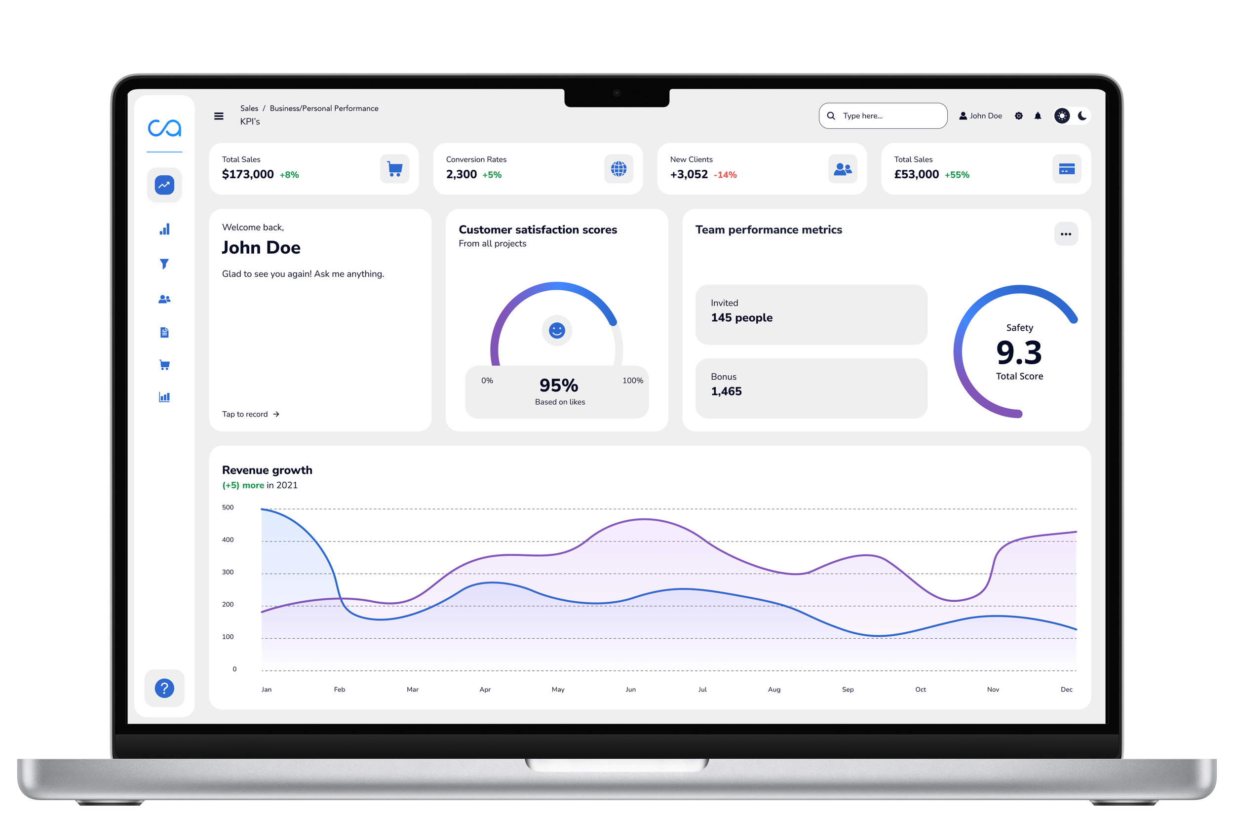
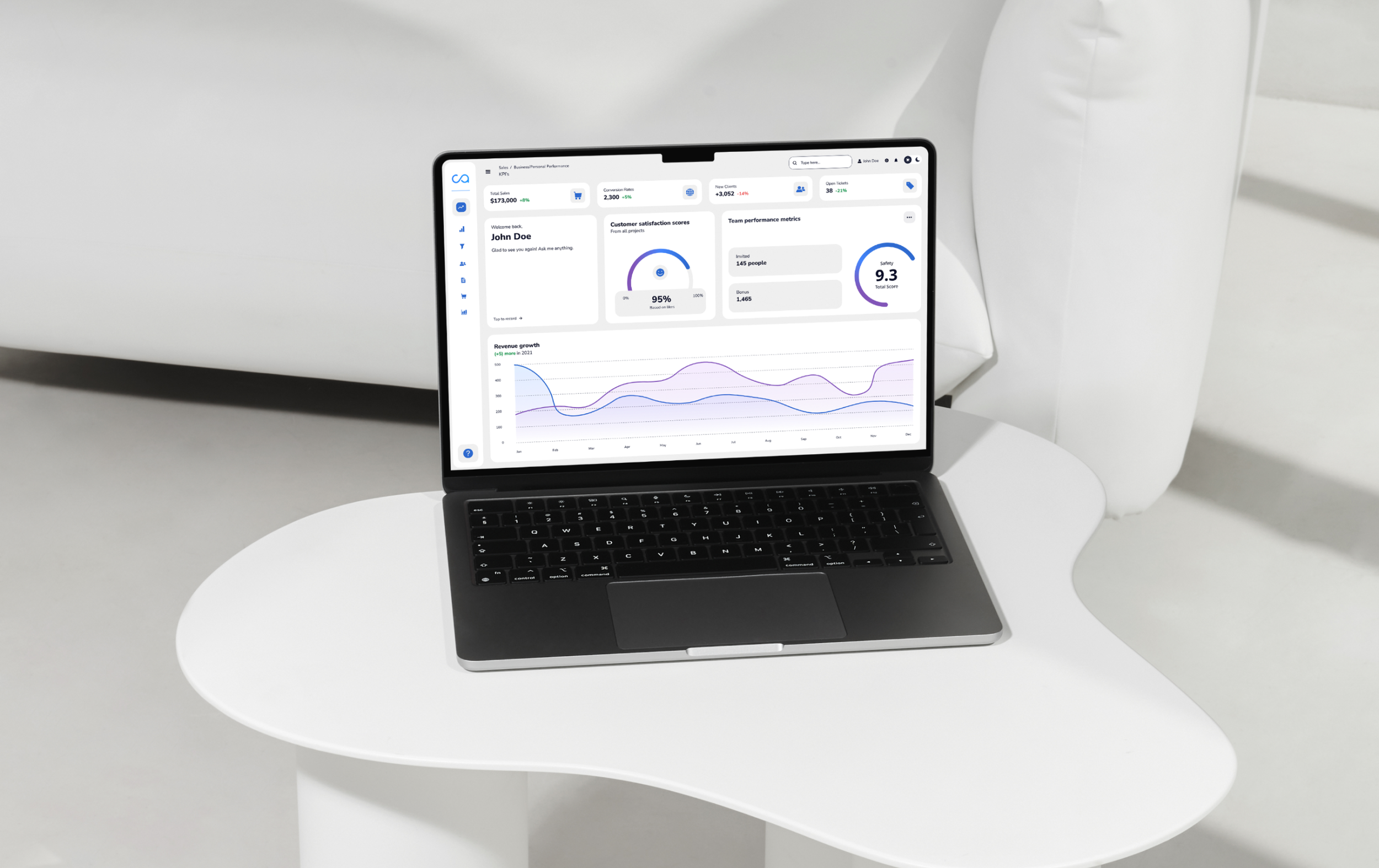
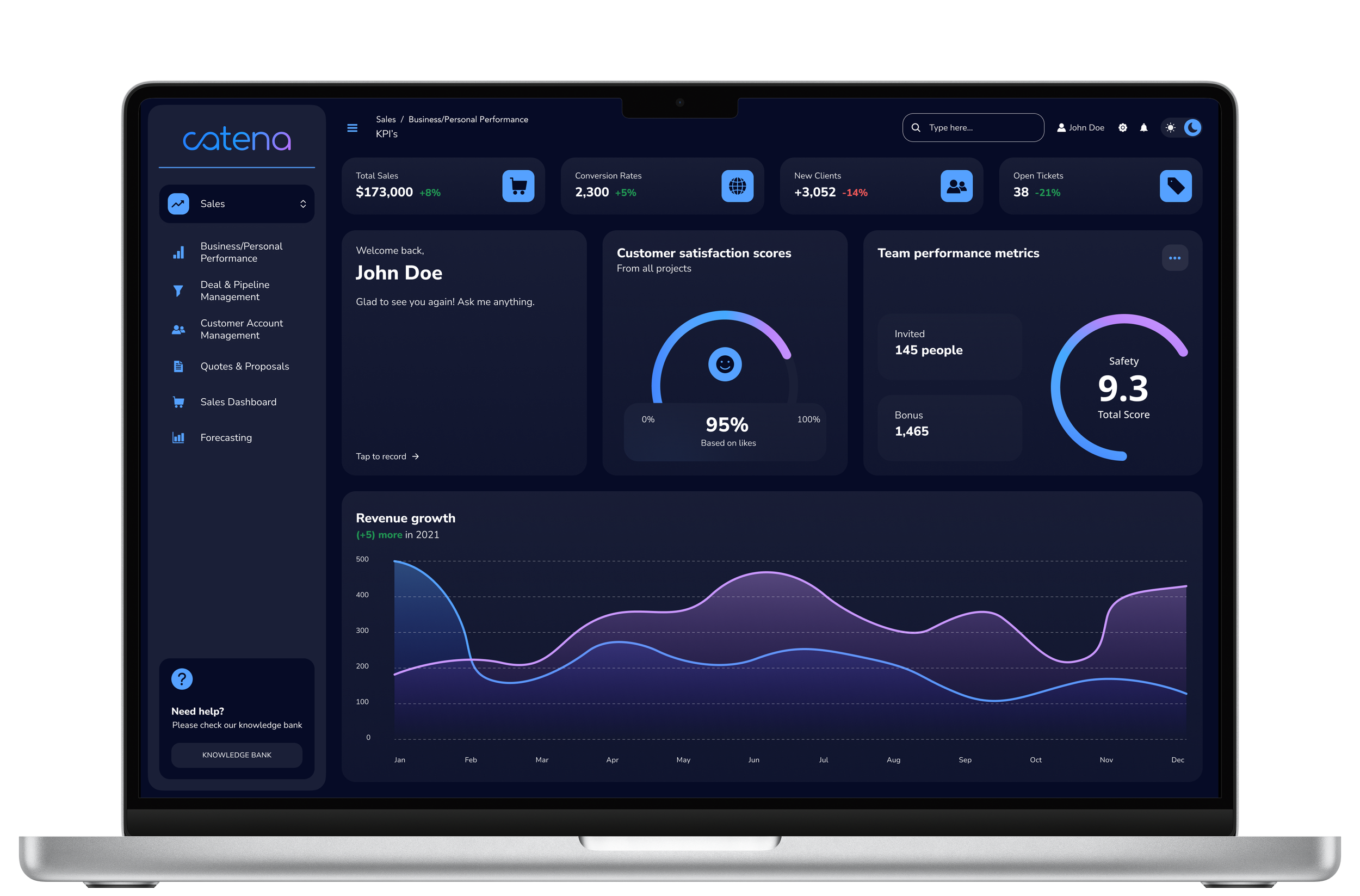
I was responsible for modernising the platform’s visual identity and user experience. My work focused on transitioning an outdated interface into a clean, intuitive, and accessible portal that aligns with current design standards.
User Specific Experiences
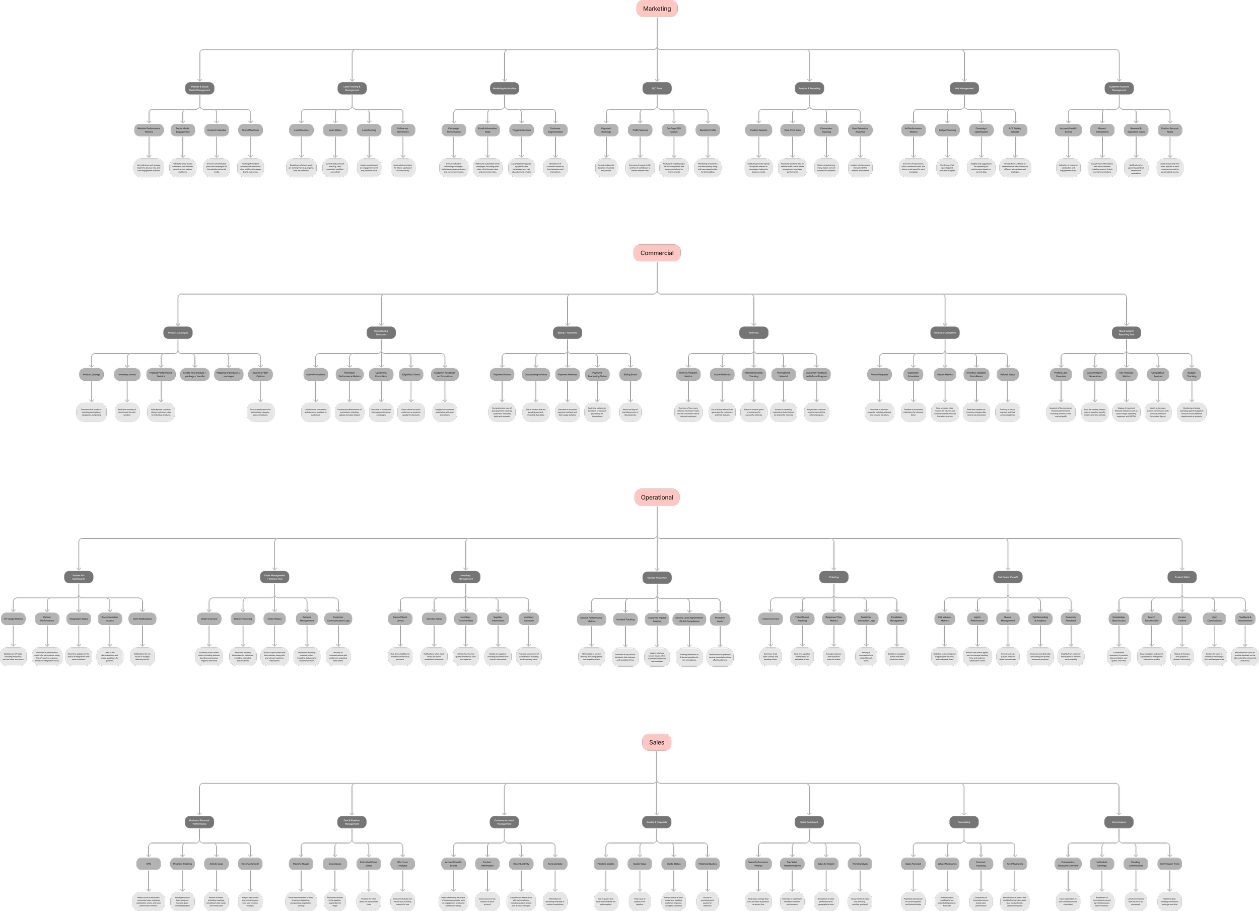
I worked with the Product Owner to reorganise the platform into four segmented dashboards for different user needs. This way, platform users see exactly what’s relevant for their specific sector, making the whole experience much smoother and easier to navigate.
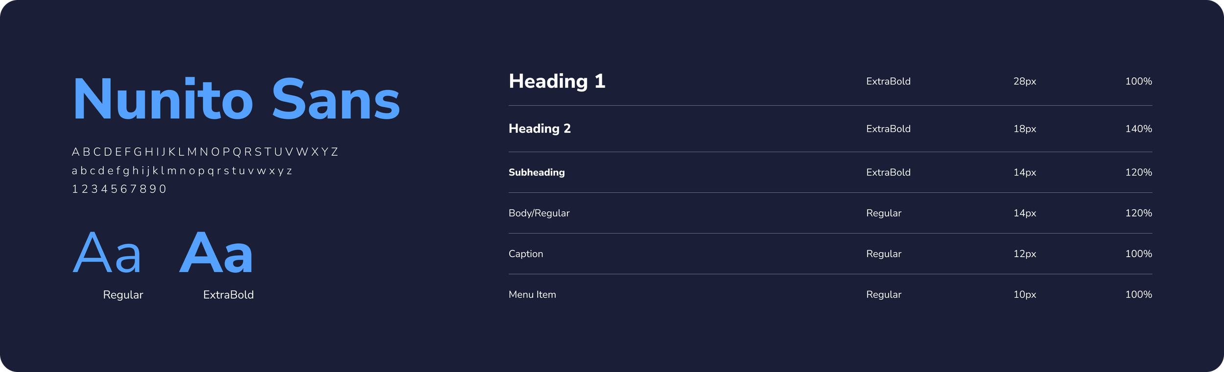
Style Guide
I collaborated closely with the Creative Lead to define the new brand guidelines. We aimed for a sleek and modern look, but made sure accessibility was a top priority. To keep the focus on a great user experience, we also included a light mode option alongside the standard dark mode to suit different environments and preferences.
#060B26
#1A1F37
#55A1FF
#BA84FB
#EFEFEF
#2D69CF
#8154B8
Components
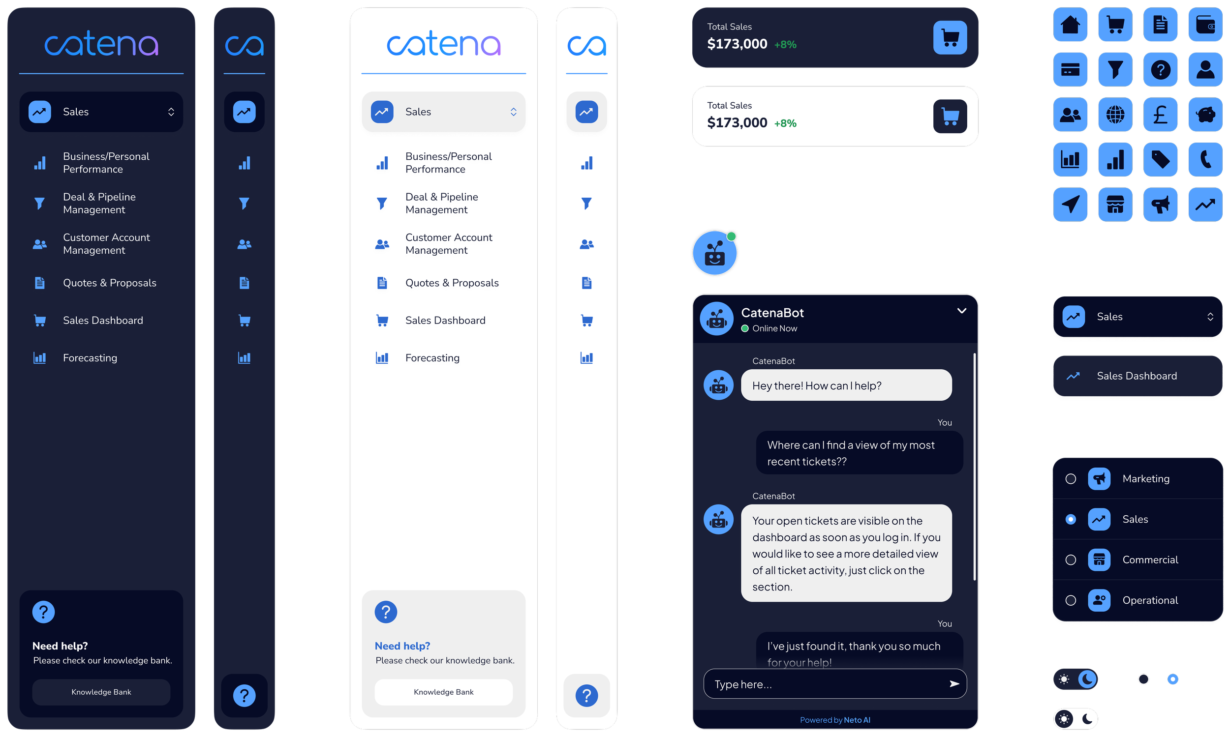
Project Insights
I led the rework of the site’s structure and visuals, focusing on a clean, accessible experience. By reworking the style guide and sharpening the brand’s identity, I ensured the new site met accessibility standards. I then guided the project through the development phase, helping the tech team bring the designs to life.
Next Steps
Now that the dashboard designs are complete, I’ll be creating a complete design system for forms, tables, and charts. This will serve as a blueprint for the developers, making it easy for them to assemble new pages on their own while keeping the look and feel consistent across the entire platform.