HAY
Website Redesign
I completed this project in the role of a UI/UX designer as part of my CPD certification accredited by the School of UX.
Background
HAY is a Danish design company that creates and sells furniture, lighting and home accessories. They aim to offer well-designed products that are accessible in terms of price and design.
My Responsibilities
I independently led a comprehensive design review of www.hay.dk, where I conducted usability testing and developed high-fidelity mockups to improve the user experience. Throughout the project, I collaborated with Bootcamp colleagues for user testing and regularly communicated with my tutor to refine design strategies.
Design Review
I reviewed the current website to evaluate what works and what doesn’t - assumptions from my point of view.
What works
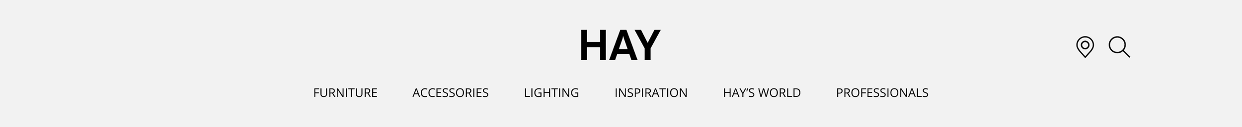
Clear brand vision to differentiate the company from its competitors
Great use of space with beautiful imagery
Clear categorisation of products in the navigation menu
Good indication that users need to find a supplier (they can’t buy products directly on the website)
What could be improved
The name and price of products can only be viewed on hover
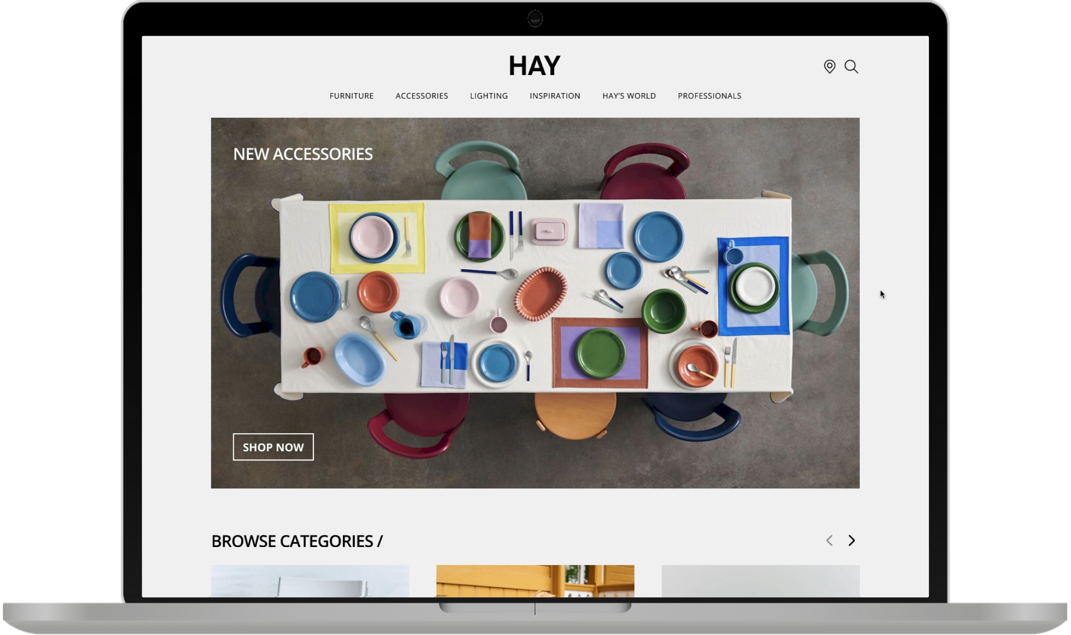
The layout looks like a magazine rather than a functional online catalogue
The subscribe CTA doesn’t have an exit button
It’s difficult to differentiate between the product styles and colour variations
User Research
I wanted to validate all the assumptions from my design review.
Scenario Walkthrough
I conducted a usability test via Zoom with 5 target audience members. During the test, participants recorded their screens while completing a task on the website, providing lots of insight to test my hypotheses.
Hypothesis 1:
Users can easily find products with clear categorisation in the menu.
Fail: 60% of users would prefer to see the range of products in the navigation menu without expanding it.
Hypothesis 2:
Name and price of products are difficult to see, they’re only visible on hover.
Pass: 4 out of 5 users felt like they spent too much time hovering on each individual tile to see product names.
User Journey Flow
To help understand the users journey within the site, I created a flow to visualise the key steps of their browsing experience.

Low-Fidelity Wireframes
Accessibility
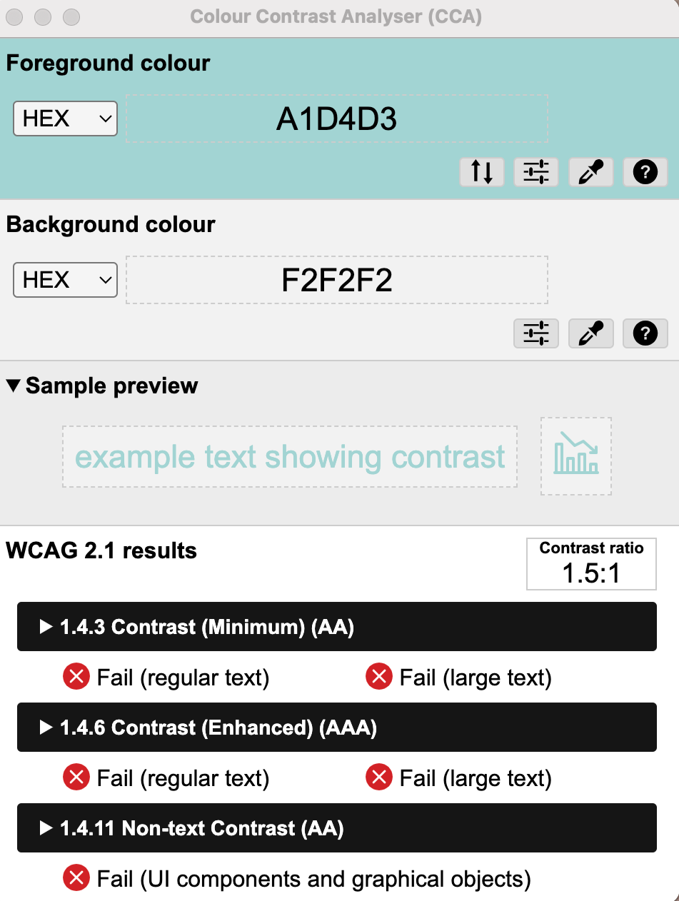
Before developing the design system, I looked into accessibility to ensure a site that works for everyone.
WCAG validation
My main goal was for the design to comply with the industry’s Web Content Accessibility Guidelines:
Content is not cropped
System is accessible on different screens
Site is responsive and loads quickly
Text size is legible and easy to change
Optimal colour contrast ratio
Hierarchical heading structure on all pages
Style Guide
Colours
#F2F2F2
#FFFFFF
#979797
#000000
#1E3FC3
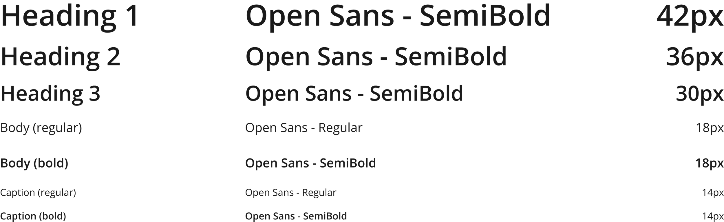
Typography
Grid System

Body
Column: 3
Margin: 50
Components
Icons
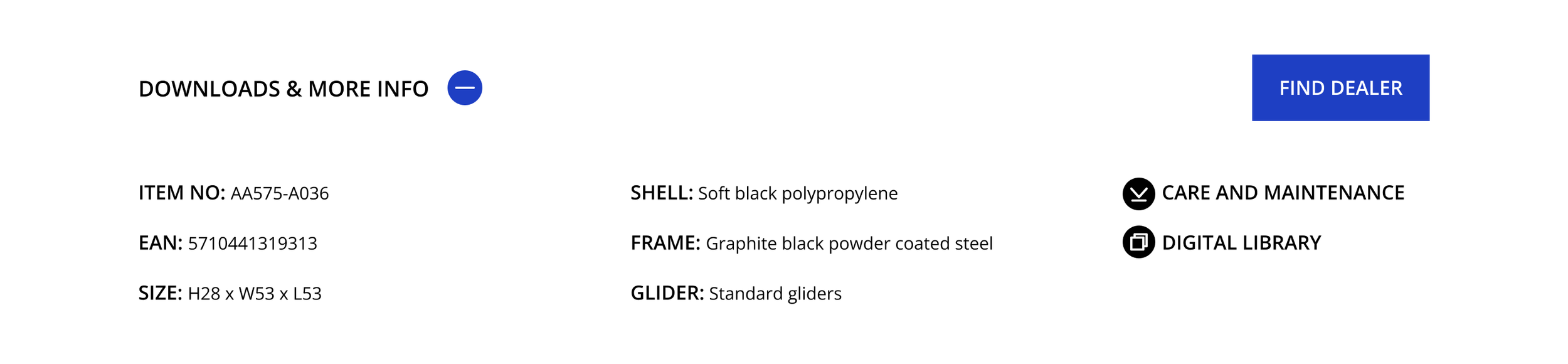
CTA’s


Navigation menu

Downloads menu
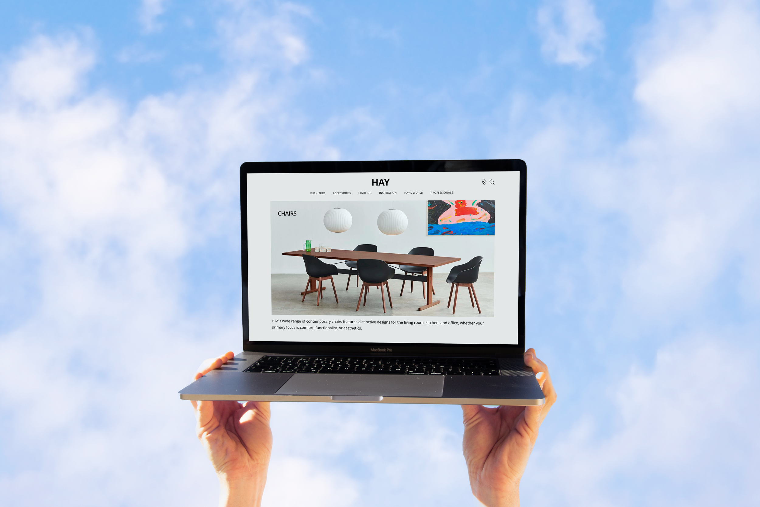
High-Fidelity Prototyping
I used my wireframes and design system to created a high-fidelity prototype on Figma. This helped to visualise the website's layout and informational structure.
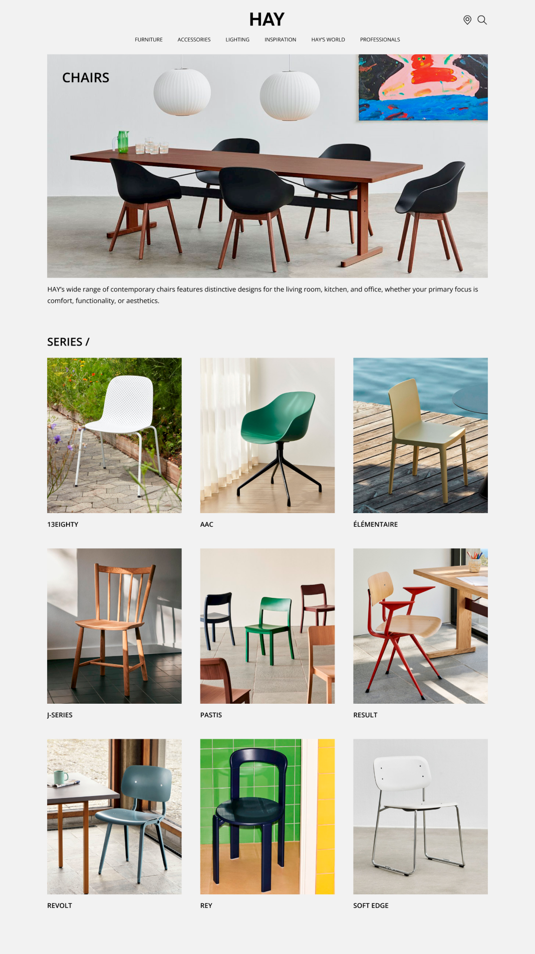
Hypothesis 1:
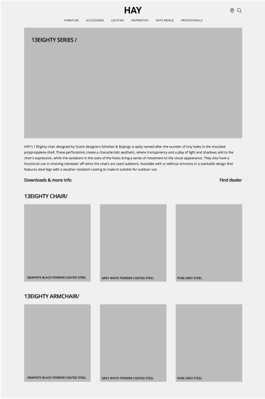
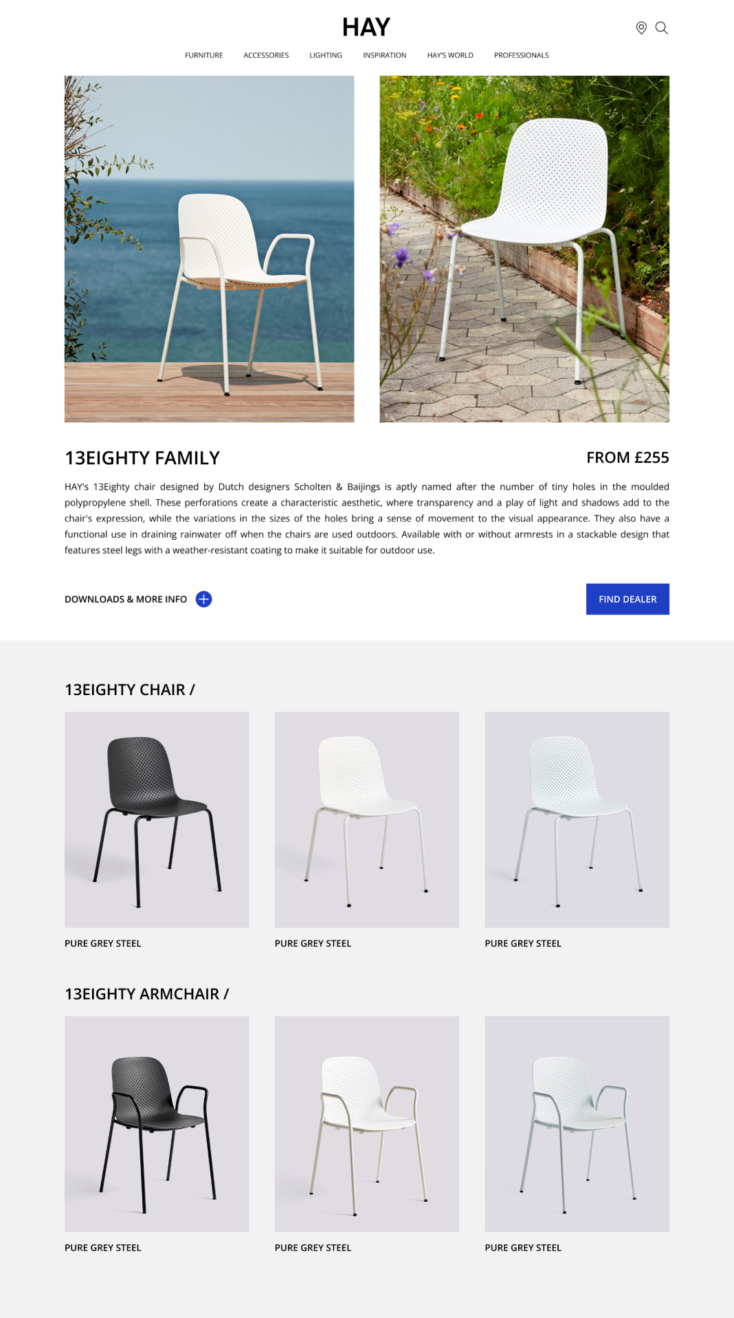
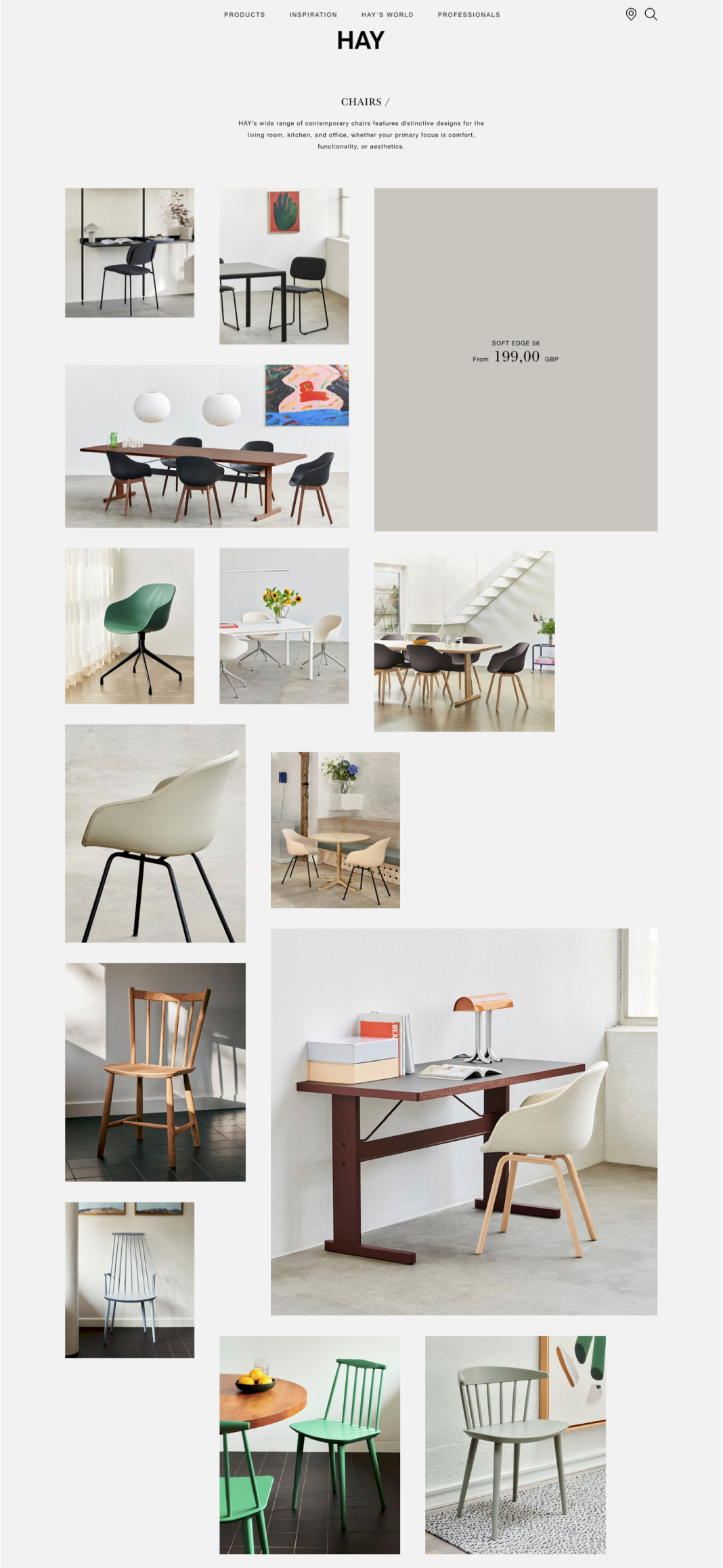
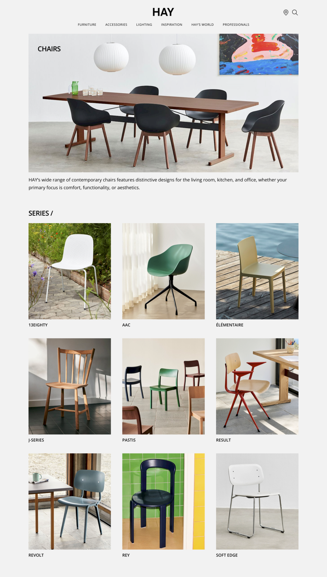
The layout looks more like a magazine, rather than a functional product catalogue.
Preference test
In an effort to improve the organisation of product listings, I created an alternative layout. The changes include a more user-friendly hierarchical structure, along with clearer product categories. I set up a preference test using Lyssna, comparing both versions of the designs to gauge success.
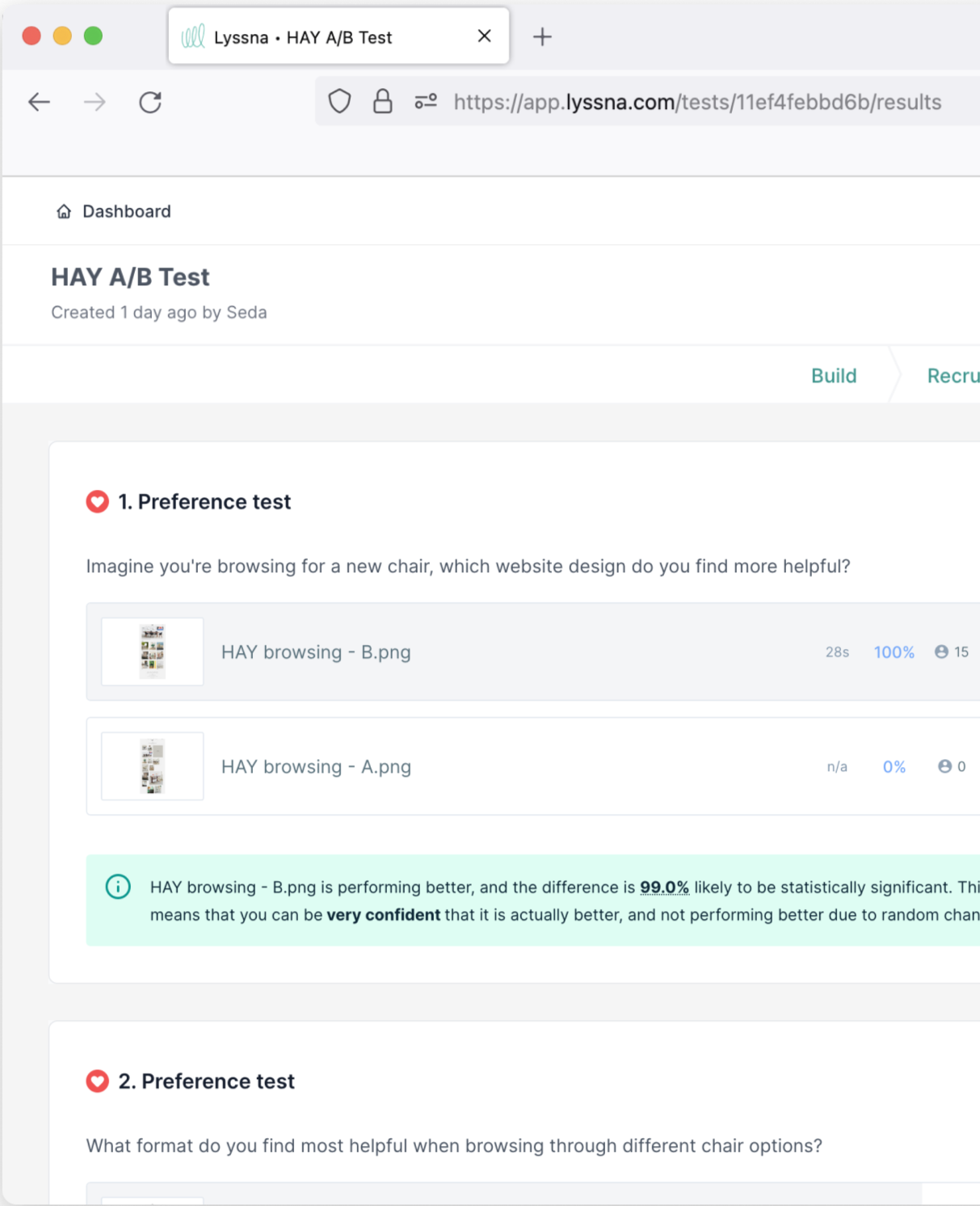
Pass: Variant B (re-designed) has a high probability to be the best based on 100% of the testers preferring this option.
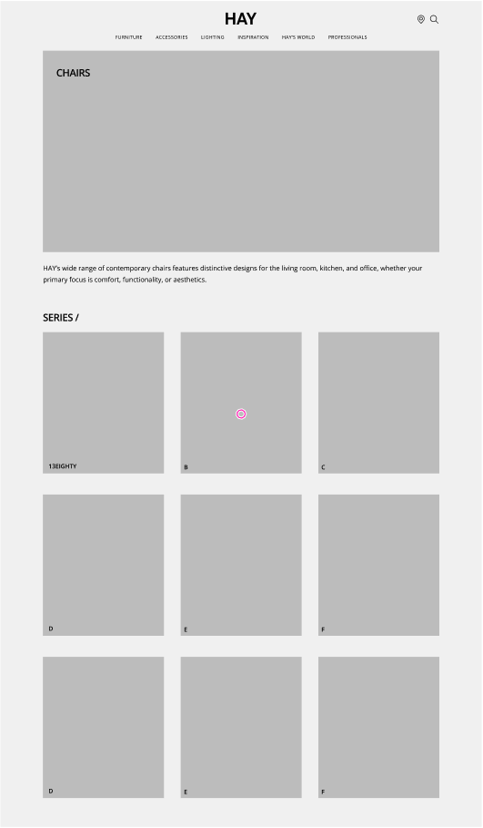
Original
Selected by 0% of participants
Redesigned
Selected by 100% of participants
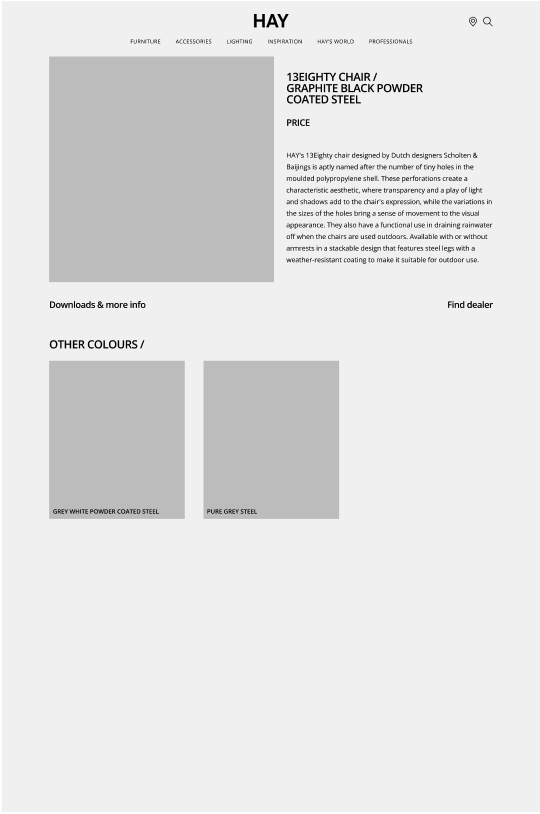
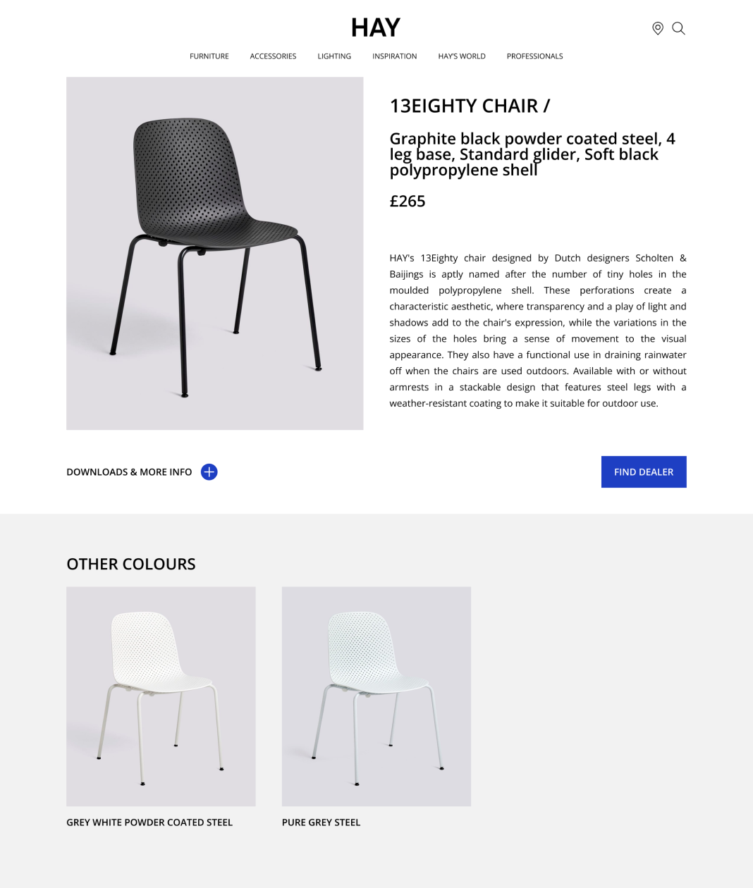
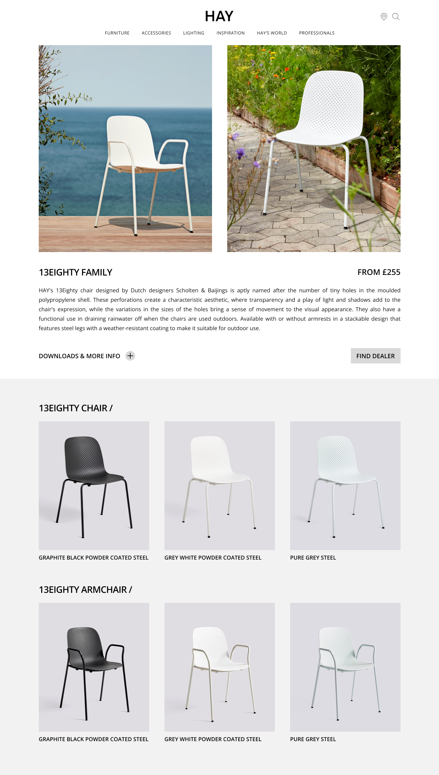
Hypothesis 2:
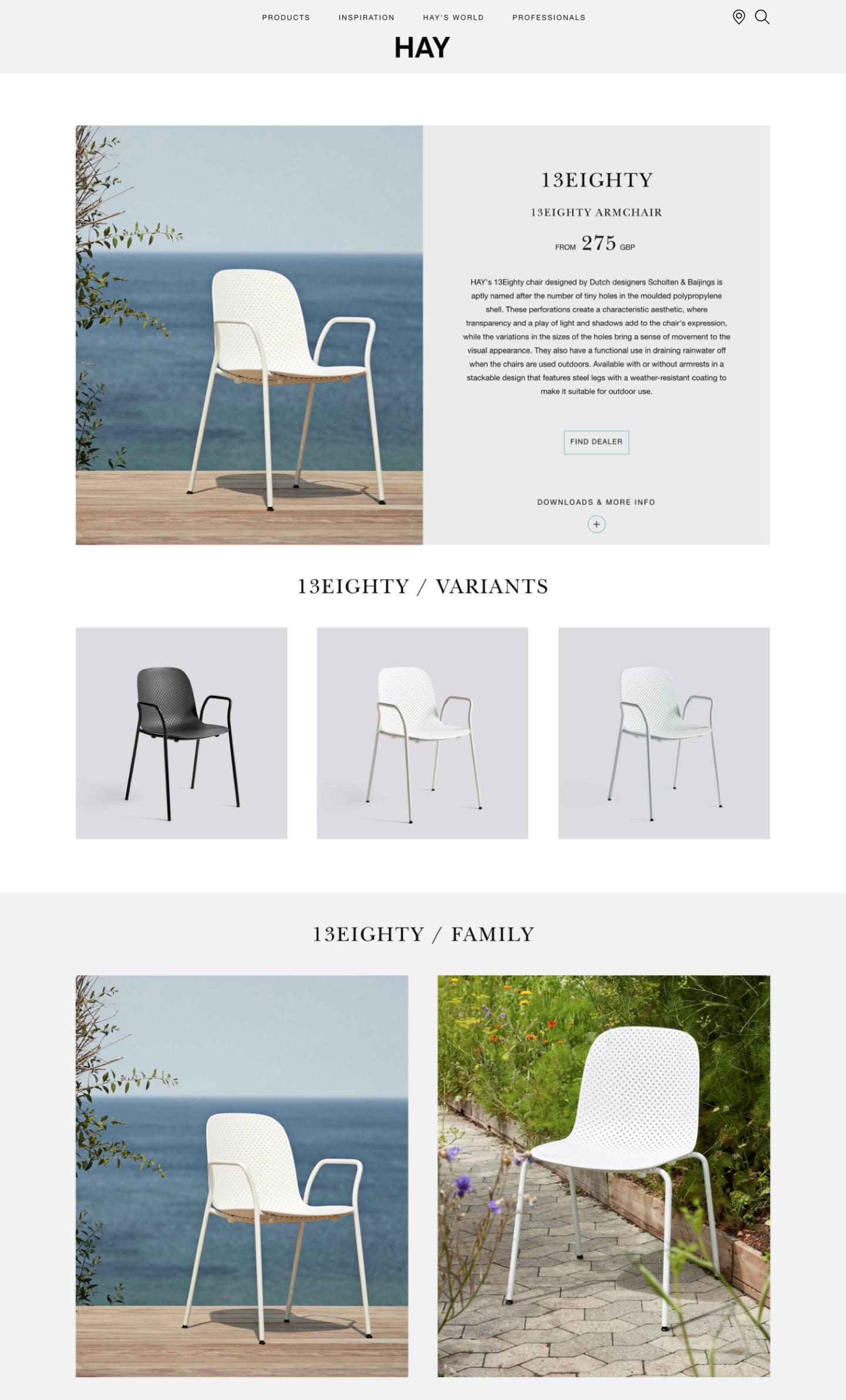
It’s difficult to differentiate between the product styles and colour variations.
Preference test
To streamline the user experience, I merged the chair and armchair variants into a single, unified page. This will eliminate confusion and the need for users to navigate through multiple pages. To determine the most effective version, I used a preference test using Lyssna to assess user engagement and identify the most helpful format.
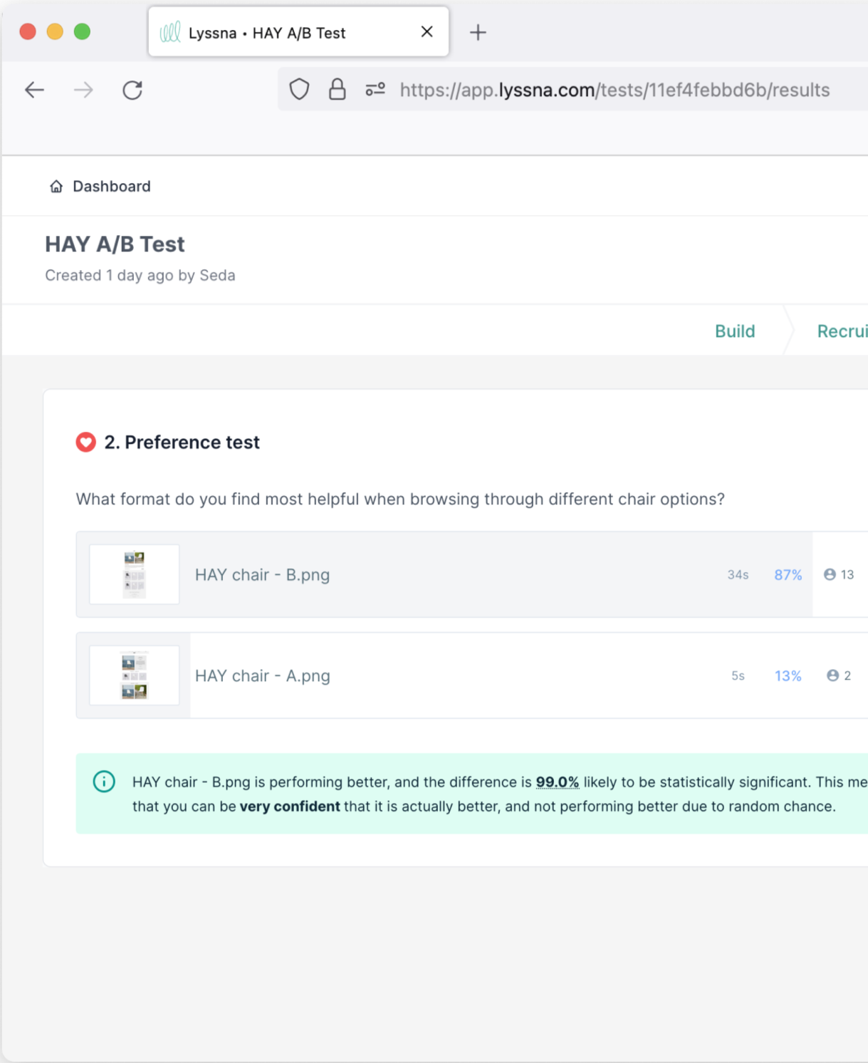
Pass: Variant B (re-designed) was favoured and found clearer to navigate by 87% of the testers.
Original
Selected by 13% of participants
Redesigned
Selected by 87% of participants
Project Insights
Having a personal interest in HAY's design aesthetic definitely added a layer of enjoyment to this project. While I'm passionate about interior design, I was mindful of potential bias. To ensure objectivity, I used data to validate my design decisions, confirming that they aligned with the project’s hypothesis.
Next Steps
During usability testing, there were issues identified regarding the menu navigation hierarchy. While I did implement a few changes, conducting further user testing would have provided the data needed to make further improvements. This is a valuable oversight to consider in future projects.