Wedge Studio
Homepage Redesign
I initially worked on this project as a product designer. Later, with added UI/UX experience, I revisited and refined the design.
Background
Wedge Studio is a pottery studio located in Newquay, Cornwall. They offer a variety of classes, from short sessions to ongoing workshops and monthly memberships. All of the classes are booked directly through their website, hosted on Squarespace.
My Responsibilities
I was tasked to ensure the website had a clearer structure and navigation system, with the end goal of increasing sign-up rates. I also oversaw the scheduling of all courses to ensure a seamless booking experience.
Design Review
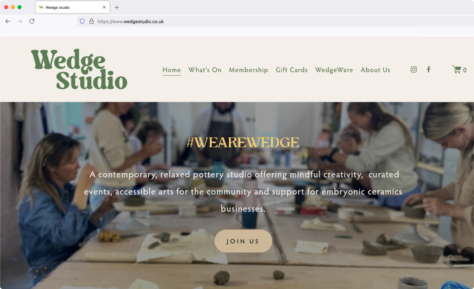
I began by meeting with the business owner to set project objectives, and then evaluated the existing website to identify what was working and what needed improvement. To keep things focused, I'll be focusing on the homepage in this case study.
What works

A good balance of photos showcasing pottery making and lifestyle imagery
The website uses font styles that align with the creative nature of a pottery studio
There is a clear navigation menu
The footer includes convenient links to social media, the studio address, and contact information
What could be improved
The lack of visual separation between sections can make it tiring to scroll through the page
The homepage is overloaded with text, and the font sizing feels unbalanced
It’s difficult to differentiate between all the types of courses offered
The same image is used for two different CTA’s, which can cause confusion
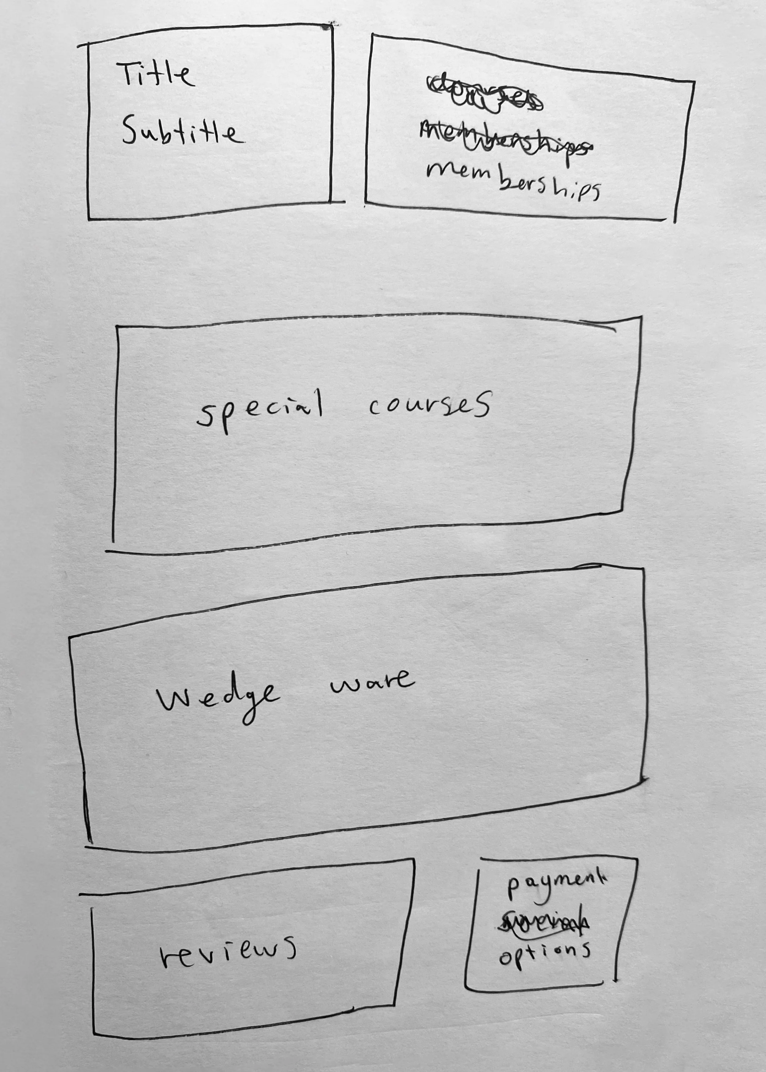
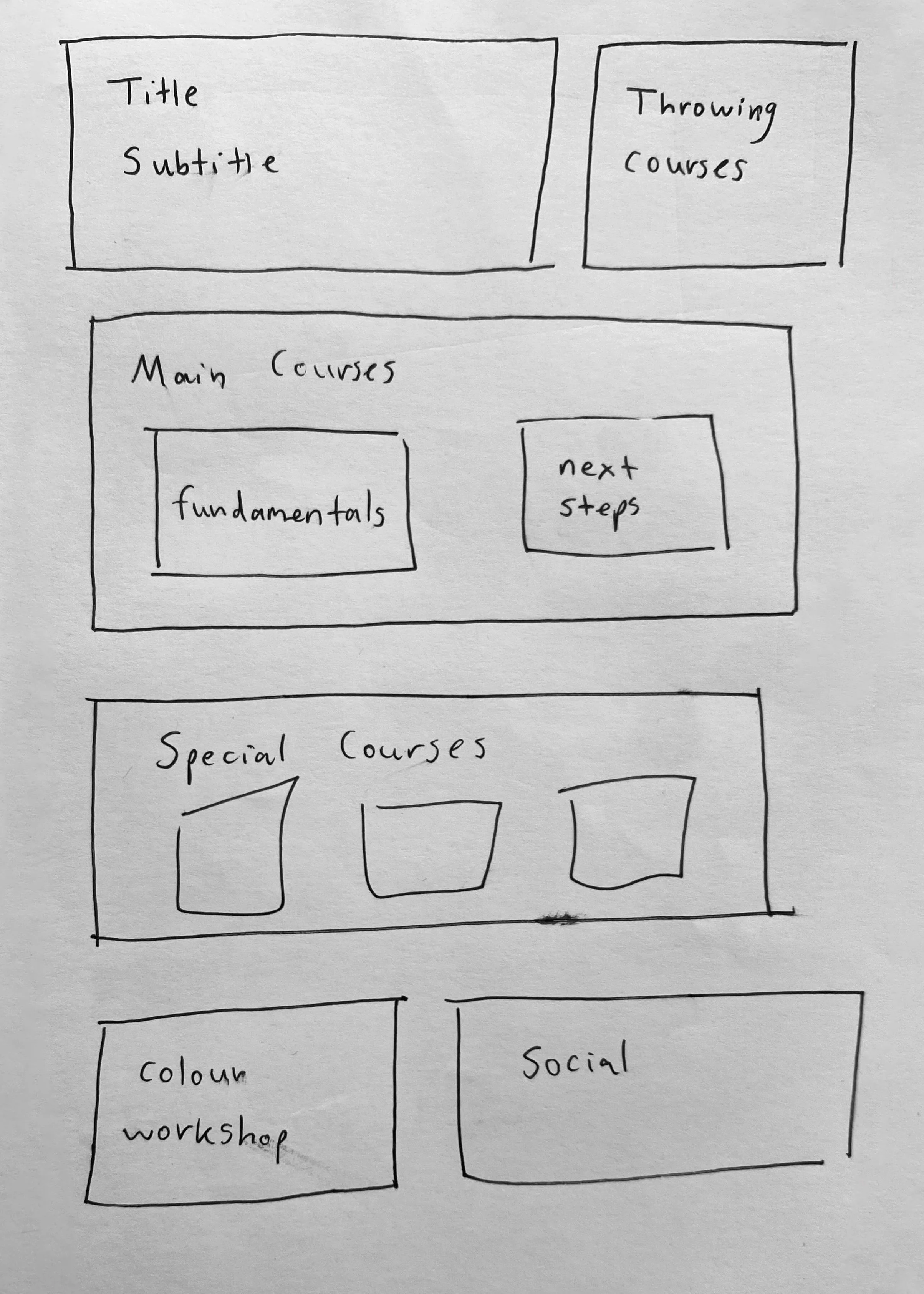
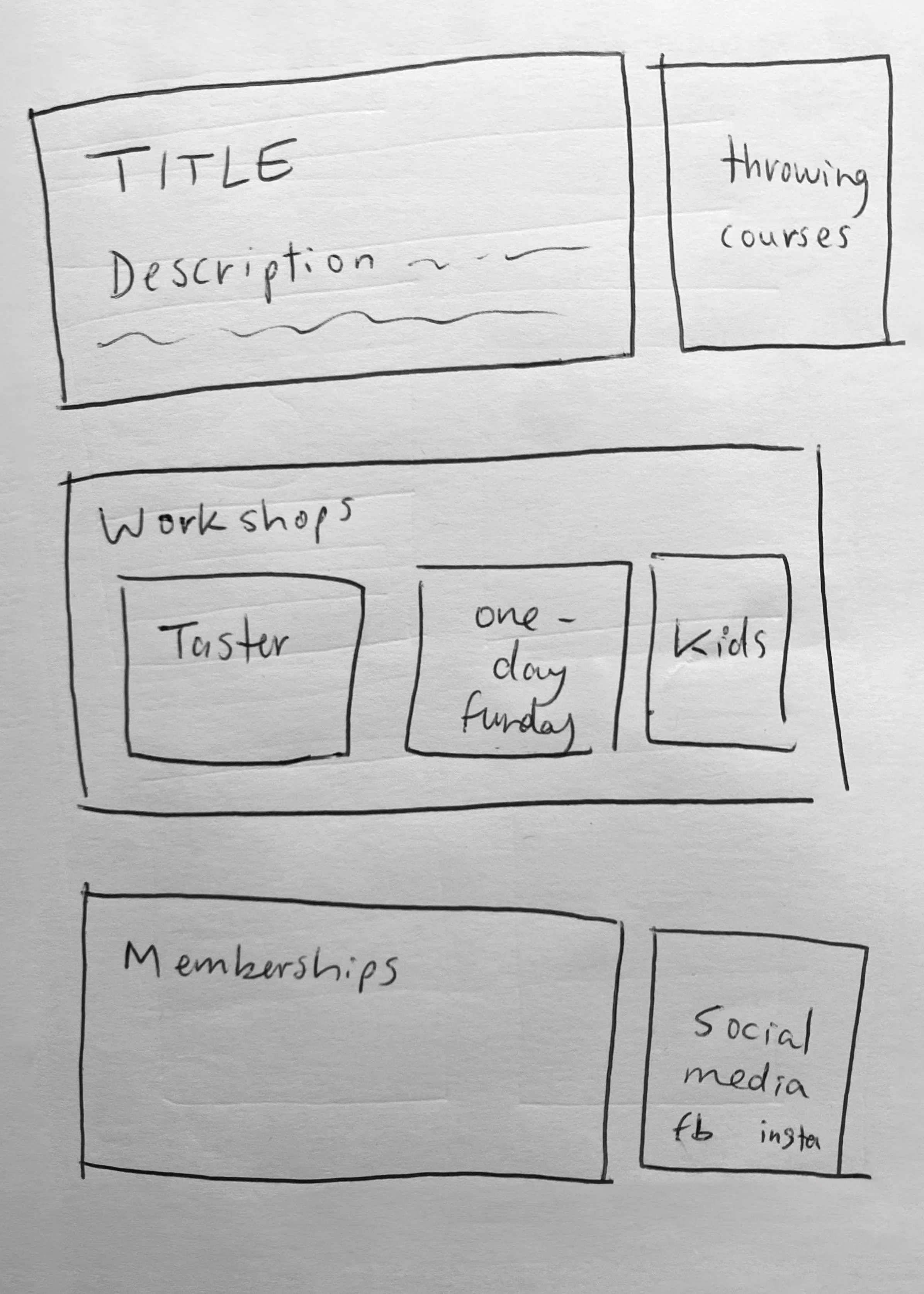
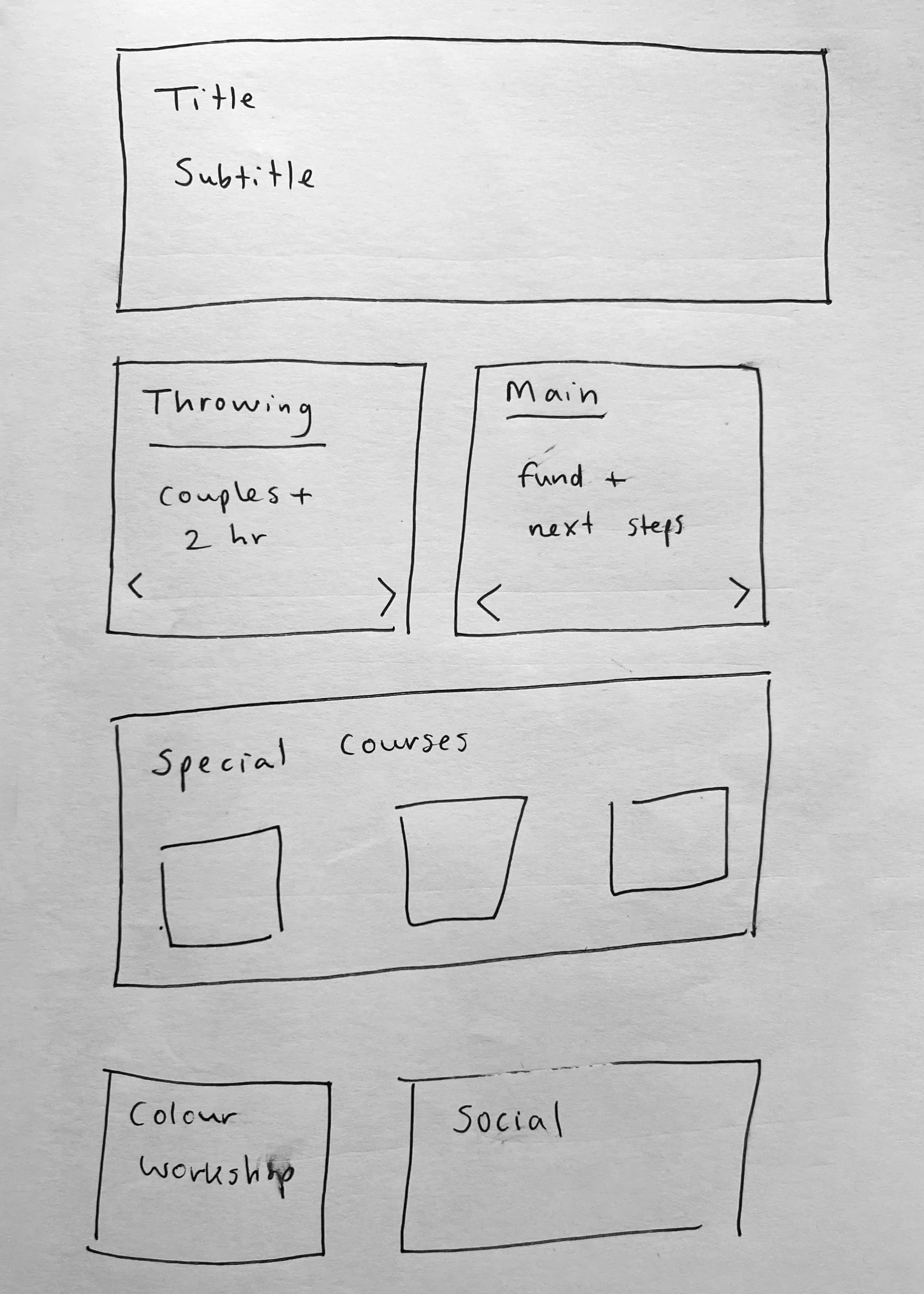
Low-Fidelity Wireframes
Once I had a better understanding of what was required to make improvements, I created a few wireframe options to establish a clear and well-structured layout.
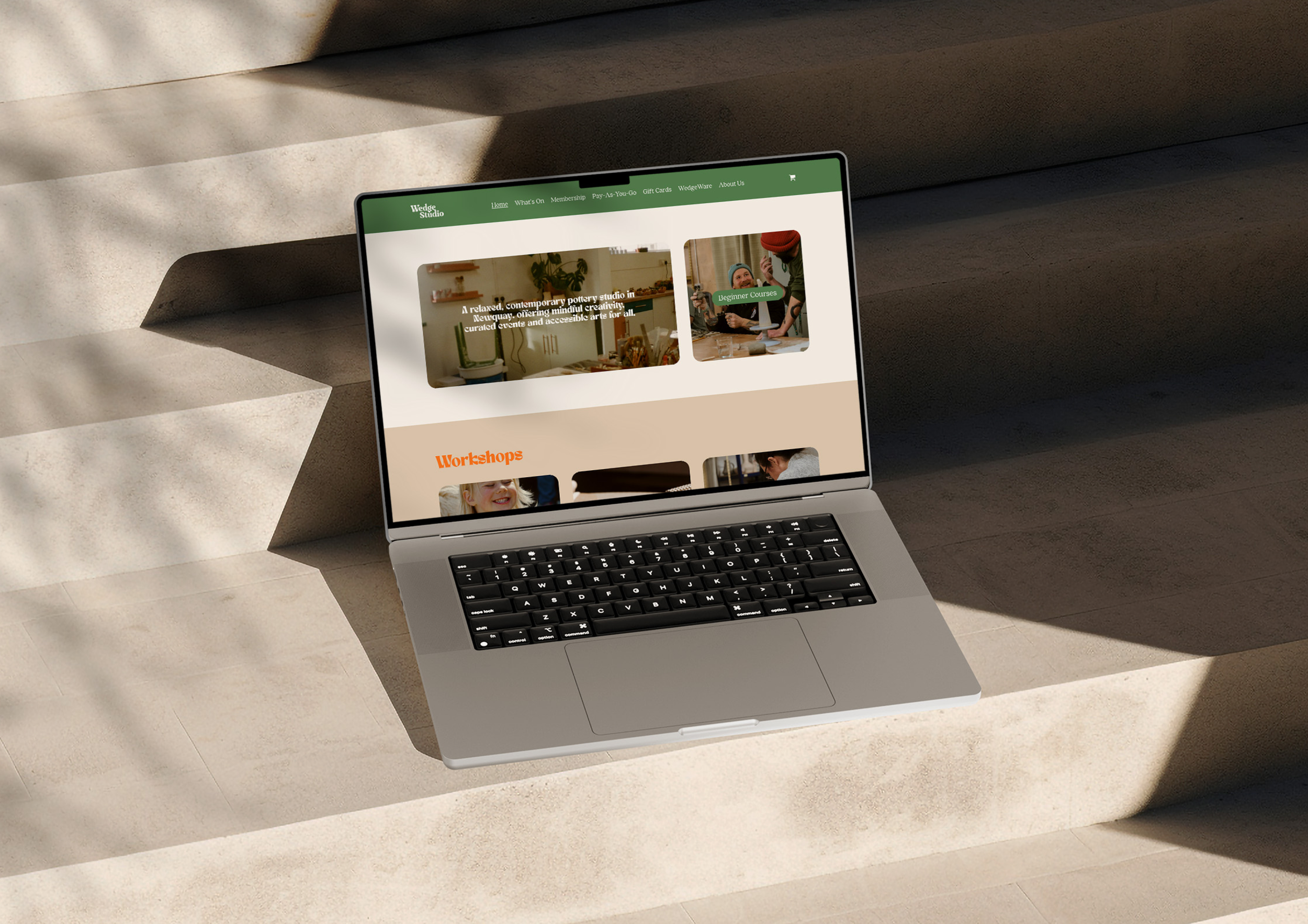
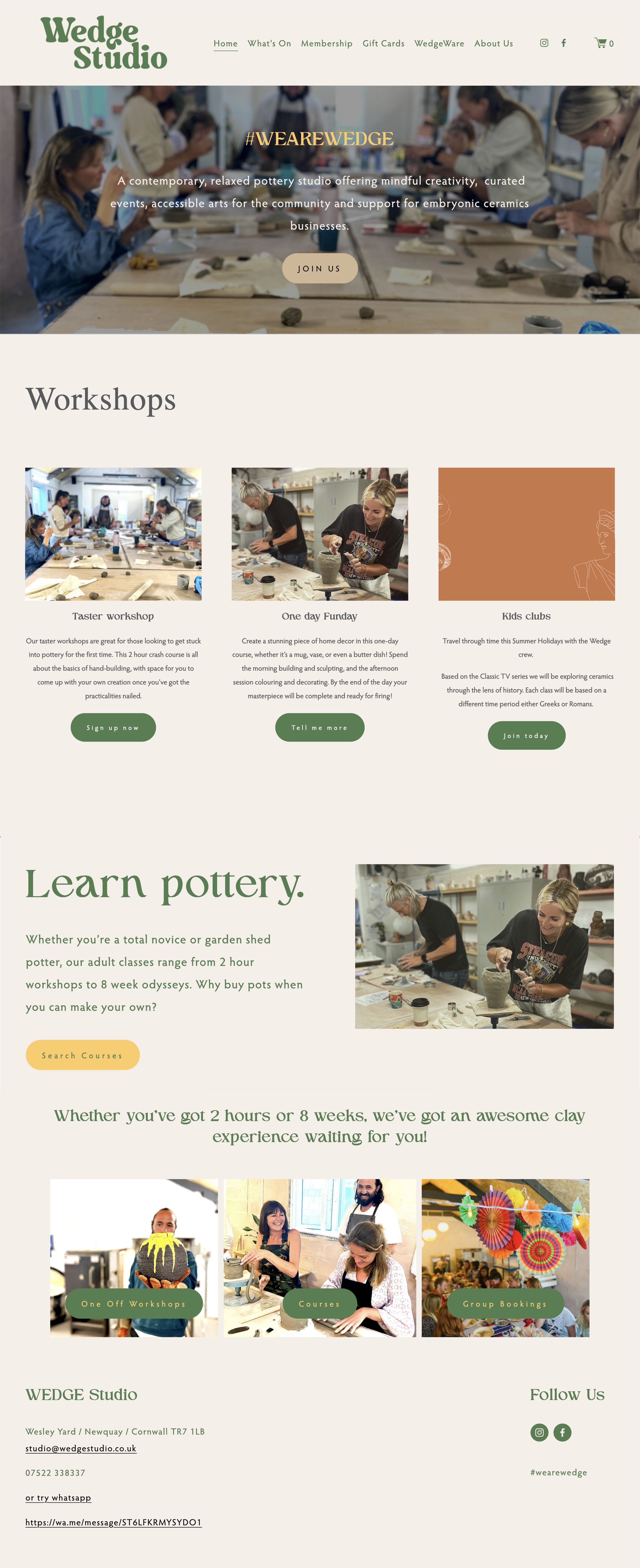
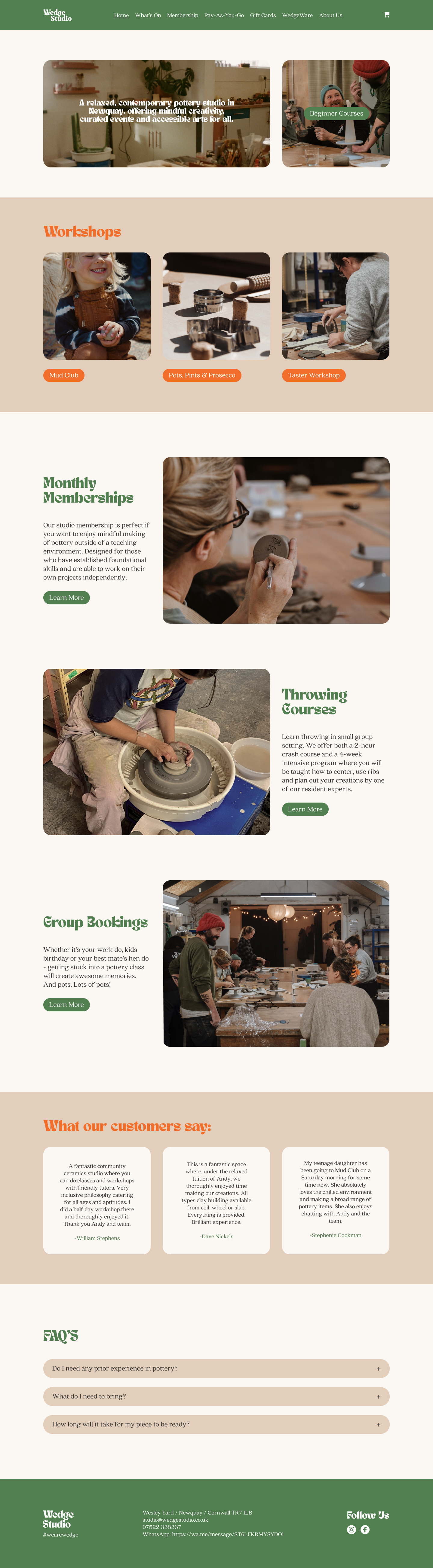
Homepage Redesign
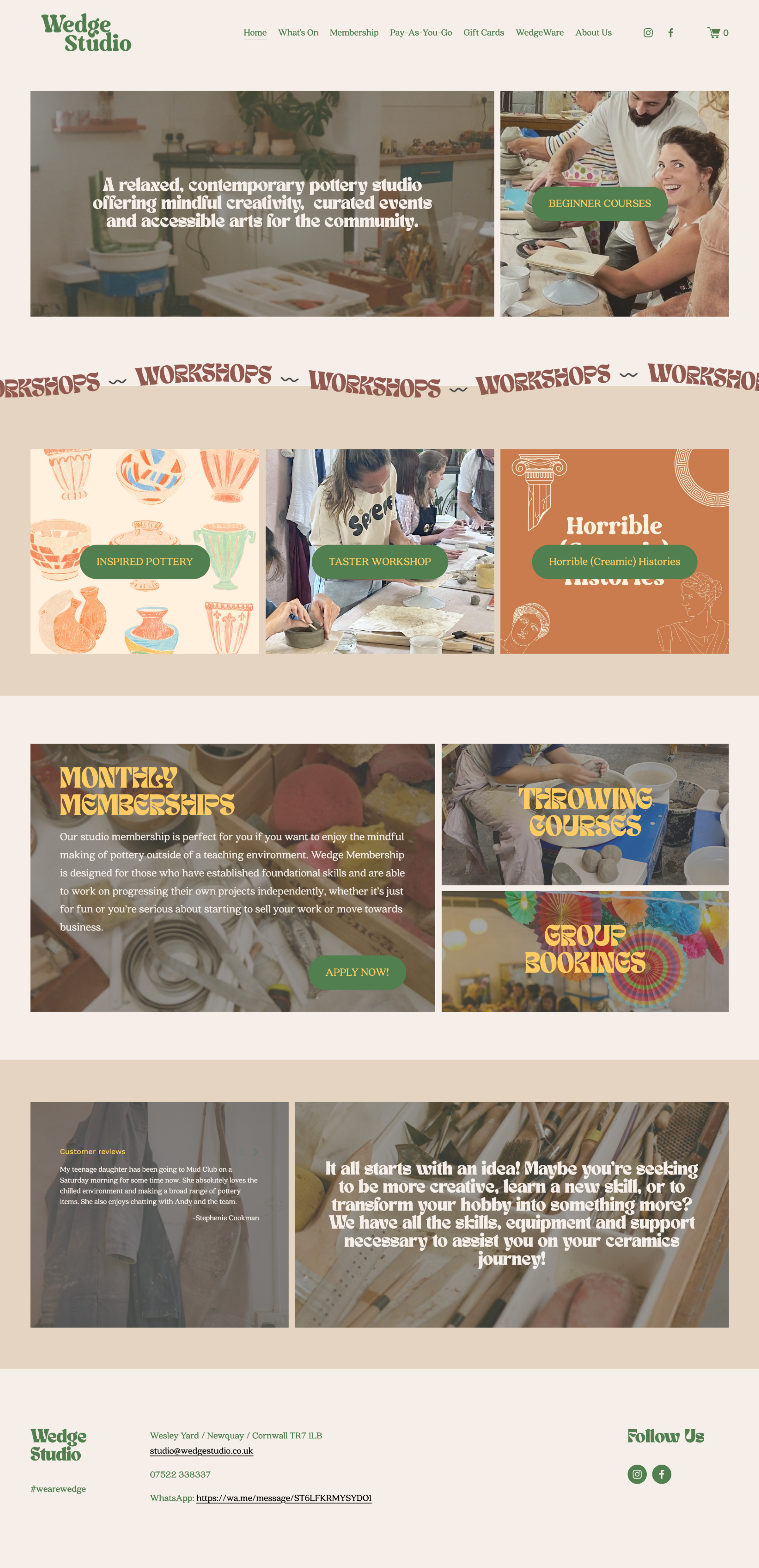
After finalising my wireframe and layout ideas, I began to implement the design using Squarespace. My aim was to create a more enjoyable user experience by designing a visually appealing and well-organised layout with clear category separation. I also balanced text sizes and used images strategically to prevent any user confusion. The redesign resulted in 21% decrease in bounce rates and an increase in course sign-ups.
Original
Redesigned
Design Revisit
I initially designed the website using my product design expertise. Upon completing my UI/UX course, I decided to revisit the project to identify areas for improvement and created a new prototype to visualise and test these changes.
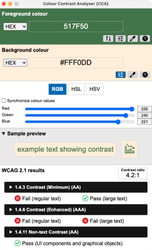
WCAG validation
I started by checking that the website complied with the industry’s Web Content Accessibility Guidelines:
Content is not cropped
System is accessible on different screens
Site is responsive and loads quickly
Hierarchical heading structure on all pages
Optimal colour contrast ratio
Text size is legible and easy to change
Style Guide
Colours
#FFCC63
#E2CEBA
#FBF7F3
#FFFFFF
#F06E29
#393939
#517F50
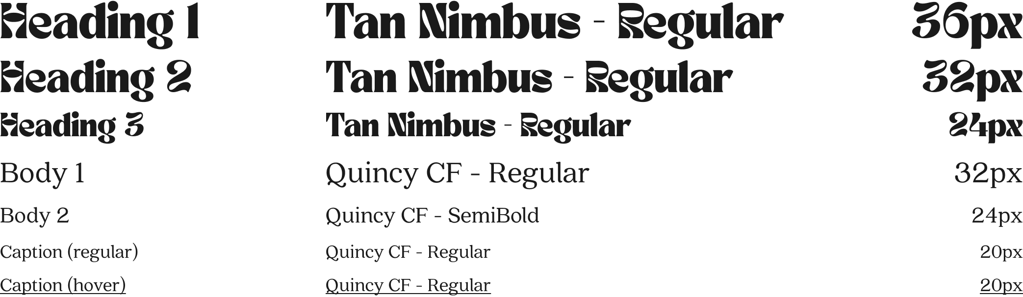
Typography
Grid System
Body
Column: 3
Margin: 143
Gutter: 20
Components
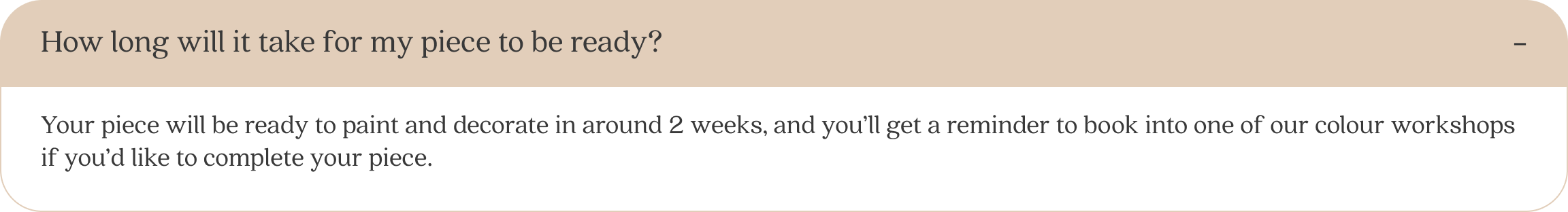
I designed components that follow appropriate proportions and comply with WCAG guidelines. Additionally, I created expandable buttons for the FAQ section to reduce the initial amount of text displayed on the page.
Buttons

Navigation menu

Footer

Expandable FAQ tile

Prototype
Preference Test
After creating the homepage prototype, I conducted a preference test using Lyssna to compare the new design with the previous version. The new design performed better, with 80% of preference. However, further feedback revealed that although the new design was easier to navigate, some participants preferred the more fun feel of the original design.
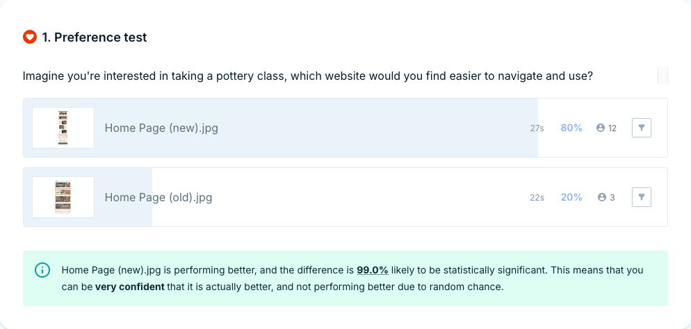
Selected by 20% of participants
Selected by 80% of participants
Revisited design
First redesign

Project Insights
I thoroughly enjoyed redesigning the website for Wedge Studio and learnt a lot from the process. While my first design was effective, the revised version shows a clear improvement, as it was created with more intention and data-driven decisions. In contrast, the first design was solely based on personal opinion, leading to user bias.
Next Steps
The preference test indicated that 20% of users enjoyed the engaging elements of the original design. Therefore, I would update the prototype by keeping the new layout but also incorporating some fun elements, such as buttons and transitions. This would need to be tested again before proceeding with the redesign.
